My latest image

thebeginning

TPF Noob!
Joined
Jan 10, 2005
Messages
3,795
Reaction score
30
Location
Texas
Website
www.danielcolvinphotography.com
Can others edit my Photos
Photos NOT OK to edit
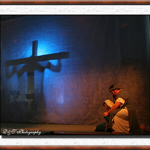
critiques and comments welcome (duh)! With this image i was trying to express oppression, and a little bit of loneliness (i guess a little bit of terror as well, most of that was covered through the oppression bit though). It's hard to explain what i was going for (as it usually is ). I notice that the subject is a little centered. This wasnt EXACTLY what i was hoping for, with the tree, when i find the right tree i'll post something similar. as you can see, quite a bit of photoshop, try not to let that kill it though, if you can :)

birdsandtreesepiasmall.jpg


bw version, slightly altered:

birdsandtreebwsmall.jpg


thanks for looking!
 
As a sucker for b/w, I kinda prefer the p/s color version of this one though I still think the b/w is nice. I think both show a nice composition and form. I really like the silhouette quality of both. Good job. (not a big fan of the red border around the first one though)
 
the black and red here for me :) a bit spooky though but neat :) I don't think it is too centered. I like it. The tree is more on the right, while the left part is empty. I like it
 
I like both and think you did an excellent choice in PS!!! I'm not sure which I prefer, although I like the positioning of birds better in the second, but I really like what you've done with each :) You're doing a lovely job lately with your shots, keep it up :)
 
I like both, although #1 shows more definition of the sillhouetted birds, i think the conversion does a lot for the mood, nice work.
 
i like one the best

maybe the border a little to heavy/thick

but i think its a good shot
 
Beautiful capture and the presentation has dramatic impact in both versions.

Well done.

Tuna
 
I like what you did with both versions. Because I have absolutely NO ps experience (poor college kid shooting film) I was wondering if you could post the original so I could have a look at it. The only question I have is HOW DID YOU DO IT?
 
i prefer #1.

have you tried the green? red works really well.
 
As a photoshop nerd...I love the first one
 
I think the red adds more contrast to the trees and birds while the B&W one seems a little too dark and actually clips off part of one of the bird's wings. It also seems to squish where your eyes go directly to the middle instead of leading you all over the picture like the clouds in the red one, which actually seems to copy the shape of the tree. :thumbup: If you try for other colors, don't make them too bright, it'll ruin the dark spooky effect.
 

Most reactions

New Topics

Back
Top