Please Critique First Try w/ Outdoor Maternity Composit

maggyday

TPF Noob!
Joined
Mar 23, 2015
Messages
4
Reaction score
1
Can others edit my Photos
Photos OK to edit
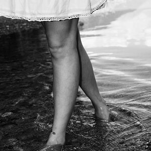
First, let me say..this is my very first post on a forum like this. I know this photo has a lot of issues. I am a growing family photographer and I just recently began to venture outdoors. My camera is the Rebel T3i. I rented an 85mm 1.2 ll for this session. I my camera and that lens are a bit of a funny pair but it's the best I can do for now. I am still mastering my settings for outdoor back light. This is the best shot I was able to get for this specific set though. In the original photo there was a wall of bushes behind the woman up to the top of her head. I spent a lot of time cropping her from the photo. I added the sunset in the background. I would greatly appreciate some input. I am very eager to learn and I already have learned a lot from doing this session. But this is the best I have been able to do with this photo after spending a huge portion of my day on it. Any feedback would be so very much appreciated.
Critique Editsmall.jpg
 
why is everything orange? were you going for a science fiction look?
 
Not at all. It is a sunset though which is pretty orange here in AZ. But I tend to have issues with my photos having an abundance of yellow or orange. I'm not sure why. But I usually color correct. I just didn't think it would look weird with it being at sunset and all.
 
The style of the shot is not to my particular taste, but I will say that you've done a fine job of compositing there. The background is blended perfectly with the foreground, the colouring of the subject has been matched very well too.

The only thing that would give it away is that she has a rim light around her which is cooler than the rest of the image and there is no obvious light source for it, but I don't think it harms the image too much.

Overall, I'd say you've done a pretty good job! Well done!
 
Thank you Forkie for a great reply. I appreciate it. It's interesting that you mentioned the rim light looking cooler than the rest of the photo because I actually did intentionally make her colors cooler so that she didn't look too red or orange. Great eye! I will take note of that. Thanks again!
 
As a composite, as Ian mentioned, VERY well done. As a maternity image, I'm afraid it does nothing for me. I agree with fjrabon that it has a very science-fiction/other world look to it. I'm not suggesting that the colours aren't real, but in mind they're not appropriate. Now, this could well be something the client loves, in which case, ignore most of what I'm saying, but it's not, IMO, a 'mainstream' maternity image. Aside from that, a few general thoughts for future consideration:

Because she's perpendicular to the camera, you've accentuated the size of her arms and thighs. I doubt any woman, pregnant or not really wants that. Consider turning her just a bit toward the camera, not much, but a little bit. Watch your choice of colours; purple and orange are NOT complimentary colours. Something from the blue/green side would have probably been more suitable. Don't forget to fine-tune hand placement. She looks like she's carrying her belly here. Have her move her hands back, keep her fingers together and remember to tell her not to actually touch; any time you touch the body you distort the skin. We don't want that.
 
is it just me, or does the image look very soft when looking at the larger size?
 
Tire
As a composite, as Ian mentioned, VERY well done. As a maternity image, I'm afraid it does nothing for me. I agree with fjrabon that it has a very science-fiction/other world look to it. I'm not suggesting that the colours aren't real, but in mind they're not appropriate. Now, this could well be something the client loves, in which case, ignore most of what I'm saying, but it's not, IMO, a 'mainstream' maternity image. Aside from that, a few general thoughts for future consideration:

Because she's perpendicular to the camera, you've accentuated the size of her arms and thighs. I doubt any woman, pregnant or not really wants that. Consider turning her just a bit toward the camera, not much, but a little bit. Watch your choice of colours; purple and orange are NOT complimentary colours. Something from the blue/green side would have probably been more suitable. Don't forget to fine-tune hand placement. She looks like she's carrying her belly here. Have her move her hands back, keep her fingers together and remember to tell her not to actually touch; any time you touch the body you distort the skin. We don't want that.


I agree with you 100% about her pose. I have been doing maternity photography for a few years in my studio set up in my home. This was one of my first sunset sessions and I did not allow myself enough time to get a good shot of her in this outfit before it got too dark and the majority of my photos in this set were out of focus. I know when I do this again, the results will be much more satisfying. I did not realize the colors looked so unnatural though and I will definitely make adjustments. The most important thing I was hoping to know about this picture was how I did with the composite. I am very familiar with Adobe Photoshop CC. However I am new to working with masks and layers. I am very happy to hear that I did well with this. Thank you for your feedback!
 

Most reactions

Back
Top