Please vote on which you like best?

rwilliams

TPF Noob!
Joined
Mar 6, 2014
Messages
104
Reaction score
16
Can others edit my Photos
Photos NOT OK to edit
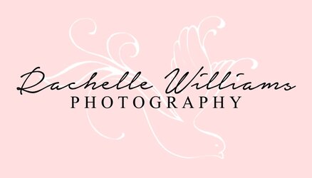
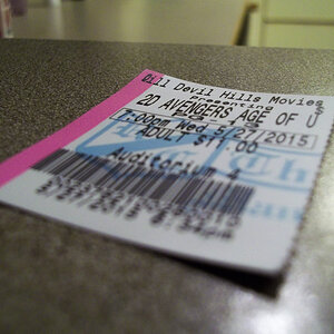
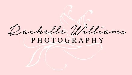
I'm working on designing my business card and can't decide how I want the placement of my logo and name on the front. The back will have a smaller dove logo and all of my contact information.
Let me know what you think and if you have any other suggestions:
$BC1.jpg $BC2.jpg $BC3.jpg $BC4.jpg

I didn't want the dove to stand out TOO much on the front, which is white I did the white on the light pink.. I also plan on ordering cards with rounded corners.
 
2 - the calligraphic font and logo need separation to my eye and I prefer the dove ascending to the nose dive in 3.
 
It seems to be showing up pretty light for me on here. But with white on pink I'd think about it being behind the lettering, otherwise the pink and white space seems almost empty compared to the contrast of the black on pink.

(And this is getting OT but at first glance the R almost looked like a printed capital D to me.)


edit - I forgot to vote! #4.
 
Last edited:
It seems to be showing up pretty light for me on here. But with white on pink I'd think about it being behind the lettering, otherwise the pink and white space seems almost empty compared to the contrast of the black on pink.

(And this is getting OT but at first glance the R almost looked like a printed capital D to me.)

Haha, others on here have said that about the R before. I'll work on it :)
 
... at first glance the R almost looked like a printed capital D to me.
Yep, me too; I honestly at first glance thought it said, "Dachelle". While I can appreciate the desire for something artistic and perhaps feminine, I would strongly advise against a font that is this hard to read. Your brand should be readily identifiable, and you want people to to remember your name; even if they don't have your number, hopefully, if they have seen your work and like it, they can look you up, but if they have a hard time reading the text on your card, they're more than likely going to move on.
 
I think #1 and also fix the first letter so it reads more easily. You want the client to read and understand instantly when you hand them the card, Perhaps more vertical separation of the two lines of text would read more easily??
 
Dachellr....a lousy capital R to start, and a dreadful lower-case e that looks all the world like a lower-case r to finish.... it's an awful script...no offense, but it's...exceedingly inelegant. As a fountain pen enthusiast, cursive writing fan, and hand letter-writer, I am shocked. The least-offensive option is the second one, with the bird horizontally oriented, and above the name. No offense is intended, but it is widely held belief among many that one's business card is often the very first and ONLY tangible point of contact between a business person and prospective clients, and a self-done card smacks of low budget.
 
I like #2 best as well, and it is true that the R is hard to read but probably just need a quick edit in illustrator!
I like the font. it is pretty and feminine, but the all pink is a little dull, it needs more punch!
 
4 is my fav, 2 is ok, 1 & 3 not so much. Agree that the R needs work. If you don't have Illustrator, PM me and I can help.
 
2 and 4. Agree that the R is hard to read.
 

Most reactions

New Topics

Back
Top