Portrait at the beach - final version?

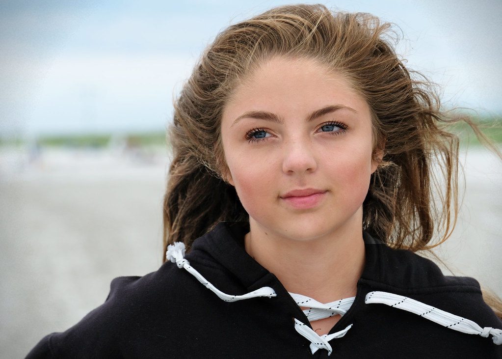
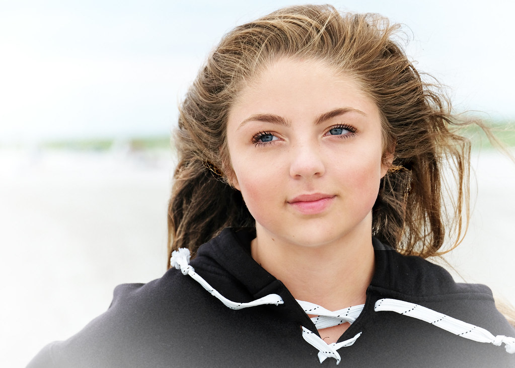
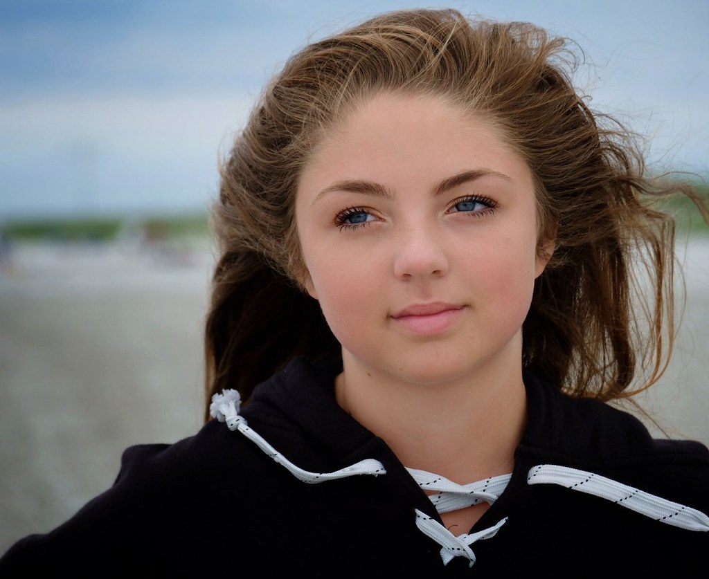
Our left is the area I thought might be cropped. I took a crack at it. My suggestions would be that the blacks are a bit too dense, mostly in the hair shadows...at the beach I expect there would be fairly light shadows due to some fill light from the sand, or from the water, or both. I added some digital fill light ( a lot, actually, +] 81), and then applied my Lightroom "Punch" preset to the crop I thought looked the best. I also used the clone tool to knock down a few pils on the sweatshirt.
35_Fill +81_Punch_800x.JPG
 
This is why photography is so much fun. I have three daughters and know your pain and joys. I'd address two areas - neither critical. First, I'd compose (or heal out) that horizontal horizon, even as bokeh it grabs me too much. So, higher or lower angle, or try another angle. Good rule - shoot allot. Something will look best later. Second, for her and that dreamy look, I'd go less low key and aim for high key, something more ethereal, a little softer, a glow, vs harder nor contrasty. And ok ... #3, more head room. But, bottom line. Beautiful girl, proud dad. A winner!! Her face structure - can't comment. Don't know her but choice of lens and distance can modify that. Thanks for posting this. Lots of constructive ideas here.


Sent from my iPad using Tapatalk
 
Ok - I edited this on my calibrated pc using PSE11. Had to edit the jpeg version but since the exposure and wb were pretty good it wasn't a big issue. Here are my final two versions. Would love to know if you like these better than my original tablet/Snapseed edit and if so, which you like. I went with @BadRad 's suggestion for a lighter, more ethereal feel on #2. Couldn't do anything about the headroom but did add some space back on the right. I think I had originally cropped that side because I knew she wouldn't like the flying hair but since this is now just for me, I can have it my way.


Last edited:
First one without the vignette.
 
honestly, except for being a little dark for my taste, your first, initial post is the best.
of your final two, the heavy vignetting on the first just kills it for me and the wife.
on the second...were not getting a "lighter or ethereal" feel...its just a blown highlights feel.

lighten up your initial post a bit and you have a winner.

EDIT: my personal opinion on vignetting is that it only really works on square or tall shots where the subject is centered. on shots where the subject is not centered and there is an unequal amount of space between the vignetting, i dont feel it really looks right.
vignetting is more or less a framing tool. im not a huge fan of it in most cases, but when i do feel it works its always with centered subjects with even side spaces.
 
Last edited:


As always, I welcome any suggestions/comments/critique. My daughter isn't a fan of this one because she thinks her face looks fat. I like it because it's not her usual selfie that makes her look 17.

She's beautiful, I really like the soft skin tone. I think all that is missing is to slightly darken the shadows/blacks to bring a tiny bit of definition to her face, but not too much that you lose that nice tone in her skin. Some more room around her in the frame might help as well :)


Sent from my iPhone using ThePhotoForum.com mobile app
 
Strictly a guess here, but maybe she thinks this makes her face look fat because her face is very square to the camera. That's something as photographers we're (stereotypically) supposed to avoid, and even the selfie generation usually shoot themselves at angles. So maybe she's just not accustomed to seeing her own face from this angle (at least in photos)?

That's not a criticism of the shot, by the way. I really like the way that, even though her face is very square to the camera, her torso is turned slightly to her left and her eyes are looking slightly to her right. This is a very nice, subtly dynamic, pose.

As for the editing, either your original or the first re-edit work for me. The skin tone and hair color are enough different between the two that it seems to me that the editing had an impact (on one or both) - they're both fine to me, it's up to you to decide which is more representative of your daughter. I do agree that the vignette adds nothing (and probably detracts).

As a parent, I really wish my girls would let me capture such a tranquil image! Nice job!
 
FWIW: I prefer the first post version. Including the crop.
 
My daughter isn't a fan of this one because she thinks her face looks fat.
This has made me curious as to what she thinks is a better portrait. Does she always wear her hair in that style? Do the photos she likes have different hairstyle? Is there on that you can post? (even if it's her phone selfie)

If she is experimenting with different styles, find a source that shows different hairstyles with different facial structures so you can see the differences in how a hairstyle can affect the perceived overall look of the face.
 
honestly, except for being a little dark for my taste, your first, initial post is the best.
of your final two, the heavy vignetting on the first just kills it for me and the wife.
on the second...were not getting a "lighter or ethereal" feel...its just a blown highlights feel.

lighten up your initial post a bit and you have a winner.

EDIT: my personal opinion on vignetting is that it only really works on square or tall shots where the subject is centered. on shots where the subject is not centered and there is an unequal amount of space between the vignetting, i dont feel it really looks right.
vignetting is more or less a framing tool. im not a huge fan of it in most cases, but when i do feel it works its always with centered subjects with even side spaces.

Thanks for the input. As for the vignetting - not sure why but it's my current obsession. I'm sure I'll move on to something else eventually!

First one without the vignette.

First one as in first in the thread or first of the two above?

First one of the last edit. Don't think the vignette adds anything.

Got it!

Nice shot

Thanks!


As always, I welcome any suggestions/comments/critique. My daughter isn't a fan of this one because she thinks her face looks fat. I like it because it's not her usual selfie that makes her look 17.

She's beautiful, I really like the soft skin tone. I think all that is missing is to slightly darken the shadows/blacks to bring a tiny bit of definition to her face, but not too much that you lose that nice tone in her skin. Some more room around her in the frame might help as well :)


Sent from my iPhone using ThePhotoForum.com mobile app
Thanks!

FWIW: I prefer the first post version. Including the crop.

My daughter isn't a fan of this one because she thinks her face looks fat.
This has made me curious as to what she thinks is a better portrait. Does she always wear her hair in that style? Do the photos she likes have different hairstyle? Is there on that you can post? (even if it's her phone selfie)

If she is experimenting with different styles, find a source that shows different hairstyles with different facial structures so you can see the differences in how a hairstyle can affect the perceived overall look of the face.

She has her "look" down pat and this isnt' it. She definitely doesn't need my help finding it, lol. Usually her hair is straight and to the side and her make-up is much more polished. We were just messing around with my new camera at the beach so she didn't get a lot of time to prepare. That's why she doesn't like this one right now but I think she will someday.
Just a selfie but you get the idea of how she likes to present herself to the world.
 
Just a footnote, if she thinks this photo makes her face look fat (I don't but I'm not a teenager), then maybe you need to review this thread by Dan Ostergren here on TPF for future shots. Portrait Contouring Light Challenge Really helped me understand facial features and how light/shadow will change the look/shape of the face such that I've learned to look for it now.
 
Just a selfie but you get the idea of how she likes to present herself to the world.
Right. She already has it figured out. I agree that the long straight frame flatters her face.
 

Most reactions

New Topics

Back
Top