Should I keep working on this ...

kdthomas

No longer a newbie, moving up!
Joined
Aug 9, 2014
Messages
1,117
Reaction score
474
Location
Denton, TX
Can others edit my Photos
Photos NOT OK to edit
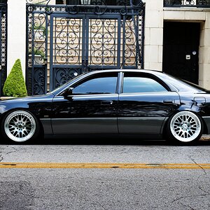
Am I going in a good direction for stock here? I know I need to refine it, ice cubes, etc ... I'm just wondering if I'm off to a good start.

WaterAndOrange (1 of 1).jpg
 
I don't know what it is you're trying to show. My understanding of stock photos may be lacking, so tell me what the idea is, then I can give you my opinion on whether you have succeeded.

What I see; a drink in a glass. Could be whiskey, but I'm not sure. The lemon is throwing me. Also, the table is quite nice. I see an oaken table at least as well as the drink, maybe better.

One thing about the lighting; it is very hot near the camera, but the fall-off leads to very dark. If you're lighting the table, I think you could even the light more.

JMHO

You're right, hot toward the camera. I think I'm going to shallow the angle of the light n raise the camera ... Or something else ... :)

I'm worried about the color ... That's actually an orange slice ... Looks fine on the calibrated MacBook but iPad its nasty brown.

I might throw down car keys & some change or something. Maybe even a hand pushing it into the frame ... Wanted to convey just having a drink ...
 
To make any money in stock photography you need thousands of shots on stock sites

Oh I know ... But I need to get the skills down so I can start doing it. I want to get to another level.

When Napoleon told his generals they would need tall trees on the side of the road or something like that, they replied, "But sir, that will take decades!". Napoleon responded, "Well then you better get started." :)
 
You're right, hot toward the camera. I think I'm going to shallow the angle of the light n raise the camera ... Or something else ... :)

I'm worried about the color ... That's actually an orange slice ... Looks fine on the calibrated MacBook but iPad its nasty brown.

I might throw down car keys & some change or something. Maybe even a hand pushing it into the frame ... Wanted to convey just having a drink ...
Now that you tell me it's an orange, I can tell it's not a lemon.

So let's see now..."having a drink" is your theme. Car keys would NOT be the component that I would have thought of. I think you need to subdue the lighting on the table, to highlight the drink more. Is this a drink people should recognize? It looks like whiskey, probably neat, on ice, and the color is reminiscent of scotch. So is an orange slice commonly served with scotch?

Maybe you need to find another component that people would normally see when having a drink.
 
Technically the image is off to a good start but there are definitely some areas for improvement. The specular highlights, especially on the table are wayyy too hot, and the colour of the fruit is... unappetizing at best. The liquid in the glass appears clear, and the ice is a bit 'messy'. I think the angle and positioning are spot on; there's lots of room for text and the empty space can be cropped away if necessary with no detriment to the image.

The artistic side however... as Designer indicated, what's the message? Have you actually envisioned a use for this, or are you just shooting 'stuff' for practice? Practice is great, essential to be sure, but practice images don't normally make good stock images.

I like the way the grain in the table "points" at the drink, but you have to watch the colour and lighting here. This looks like you tried to do it with one light; I see this as being a 3 light set-up (minimum). One low, VERY diffused light directly overhead (or nearly directly), one VERY tightly snooted light to illuminate the fruit (thus preserving colour), and one to illuminate the actual beverage, again tightly flagged or snooted so that we can see the colour of the liquid.

On a somewhat related note, a lemon slice garnish seems an odd choice for a highball glass. When I get a good glass of single-malt, I don't expect it to be polluted with fruit. Perhaps try a different glass, or skip the garnish?
 
Can't add much more to this discussion that @Designer and @tirediron didn't already mention.

One thing: clean the glass well. I can see dust and spots around the top and inside/outside of the glass. Also, there is a tiny dot hovering above the glass in the darkness.
 
Use a quality polarizing filter to control or minimize reflections when you shoot liquids, glass, and ice.

Think about how a stock photography user might want to add copy (text) to the photo you are making.
Think about how they may want to crop/edit your photo to use it.
The less they perceive they have to edit the more likely they are to buy.

The composition of the shot with the subject centered side-to-side may make the photo less desirable.
The table has 2 strong diagonal/leading lines in it that intersect at the lower right of the frame.
People's eyes follow leading lines in a photo unconsciously. So most people looking at your photo will wind up with their eyes in the lower right corner of the frame. Their eyes may continue to scan the frame, but when leading lines lead out of the frame many people leave the frame and move on to something else to look at.

Advertisers are keenly aware of how people use their eyes when they look at advertisements.
The more you know about advertising the more able you will be to make stock photographs that will sell.
 
Don't know if you're familiar with the Photo District News Photo Magazine Professional Photography Industry News and Resources which covers commercial photography, some stock; I think you'd have to be really good to do work at that level. I've seen sites online that seem to be do-it-yourself stock of poor quality or seem to not be much more than photo rights grab sites.
 
Hmmm I needed to change the angle because I couldn't get it right with getting hammered with glare, as tirediron said. Switched to lime to try green instead, reminiscent of gin & tonic? Or is that a lime wedge?

And yes, this is just one light, trying to stick with one for simplicity. And I have only one snoot :)

Added some keys & coins to make a bar setup. I also still have some lines converging in the right lower corner, but I can burn those out I guess. I'm a little worried about the OOF coins but not too worried because they're not the point of the scene. The drink is the scene, the keys & coins are just atmosphere.

WaterAndLime (1 of 1).jpg
 
Much, much, MUCH improved! This is definitely moving in a better direction; the lime works well, the drink 'makes sense' now, and there's a very clear message to the image. I would actually shoot this two ways: (1) with the keys & coins in sharp focus and the drink soft, and vice-versa. I think other than playing with the lighting a little to see what you can get, you might consider adding some background; maybe a row of barely visible, very OOF liquor bottle shapes or something, just for a little more visual interest.

As for snoots, flags etc... Head thee to your nearest craft store and/or Wal-mart and pick up a selection of black and white construction paper, foam-core and gaffer's tape. A snoot is a 2 second fix, roll a piece of paper into a tube, gaff-tape it to the light, done. This doesn't have to be complicated (gear-wise at least), and yeah, what Keith said about the CPOL!!!!
 
I definitely like the direction the 2nd image is going in, but I'd lose the keys all together. Some people could compare it to drinking and driving and most commercial buyers are going to err on the side of caution.

You could have some slices of the fruit next to the glass, maybe a cocktail napkin, add some currency to go with the coins. Or the best option would be a bottle off in the background purely out of focus.

99% of the time, it's not great to use real ice cubes as they photograph horribly. You can buy the plastic fake ice cubes and they just show up better.

You're a tad centered in the image without a clear direction that some buyers need to consider where to place their text for the ad. Take some basic text and make a mockup to see how it would work if you were the client. This helps you layout the image in a direction.

For me, it fades to black a little too quickly behind the glass, a smidge more light would make a dramatic difference and provide a little more depth to it.
 
Cool ... next time around I'm gonna use a scrim to soften the light a bit, and lose all but a couple of coins if any ... maybe put in a bar napkin. Gonna get fake ice cubes as well.

I would actually shoot this two ways: (1) with the keys & coins in sharp focus and the drink soft, and vice-versa. I think other than playing with the lighting a little to see what you can get, you might consider adding some background; maybe a row of barely visible, very OOF liquor bottle shapes or something, just for a little more visual interest.

Tirediron are you saying blend the two focused images with a layer to get the whole smash in focus. Or just two different ways to see how it comes out? Not sure I can do the liquor bottles with logos & all, but I will definitely try that. I'll also see if I can do the snoot thing today.
I'm saying two different images of the same scene. In one image the focus is on the drink, in the other on the keys & money. I see this as an anti-drink/drive image. As for the liquor bottles, no labels or anything, just the shape in the background.
 

Most reactions

New Topics

Back
Top