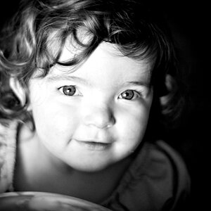
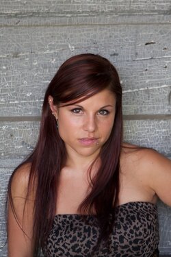
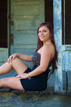
The WB is the same in all the images I did do some post to warm them up a bit. Taken individually is the WB unpleasant? I have a landscape of the second but it had a soft focus I couldn't see until the images were on the computer but I totally agree it would be better. What about the third doesn't flatter? Is it the crop or the pose? The hands are a bit stiffer than I would have liked but...
Id agree with the above from Ron. Although the pose in the first one just seems off. Second one would be good if in landscape. Third makes her look kinda chunky to be honest. Im guessing why Ron is stating the WB is different on all three is because her hair seems to be a different shade in each by a slight amount. Skin included, but thats just my thoughts, im by no means pro at all.
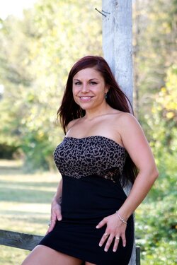
#2 works best because the lighting on her face is 'short lighting' and makes her face look more rectangular. The pose also helps make her look more svelte and the not square to the camera facial angle also narrows her face.
In #1 I would use the Liquify tool to soften the angle of her jaw and cheek under her chin camera left. The high camera perspective helps with her broad jaw line some as does the flat limiting (minimal facial mask shadows.
In #3 the light is very unflattering as is the low camera perspective. The light makes her face look very broad, and the low camera perspective makes her look thick.


![[No title]](/data/xfmg/thumbnail/37/37606-3c9ffb5906173fa2aa489341967e1468.jpg?1619738148)