Style question

Overread

hmm I recognise this place! And some of you!
Staff member
Supporting Member
Joined
May 1, 2008
Messages
25,422
Reaction score
5,003
Location
UK - England
Website
www.deviantart.com
Can others edit my Photos
Photos OK to edit
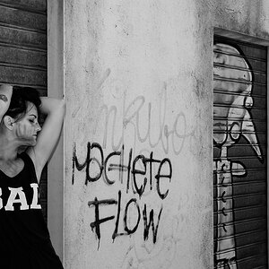
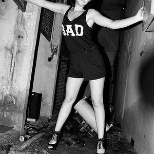
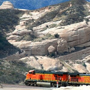
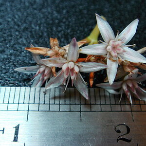
So after having a look in the 2016 year in photos thread I started to wonder if my editing style (which I've mostly fallen into rather than crafted specifically) might be going a bit too far with adjustments; if I'm going too glossy or colourful compared to reality; or at least compared to roughly realistic-ish-photography (I'm aware that's a very debatable point on its own).

I've not done a huge amount of photography this year nor much in the way of aiming to do a marked improvement or focus in editing; if anything my method is very quick currently and very much a case of following kind of formula with regard to appearance.

So it strikes me that I should have some other eyes have a look at the body of work and give me an impression from outside of my own.

Alex

I'm aware any view of a collection instead of a few is a taller order to ask for; but I'd welcome any feedback and views people might have. I hope to do more photography this year so having a few thoughts to get started on the new year would be great.
 
A tad too much saturation, perhaps - and definitely with the show jumping: real grass is never luminous.
 
Quick impressions: brightness is a bit high on some images, perhaps .25 or .33 EV higher than I personally think is right, like on the several outdoor shots of the two lemurs wrestling for example, and on the show jump shots early outdoors...brightness just at the very edge of going over. Saturation? I dunno...seems high-ish, maybe a bit too high on the red jackets of one of the horse jumpers, yet overall, not the craaaaaaazy-high saturation many people go for. Overall, looking at 50 images or so, I think one thing needs a slight style change, and that's either 1)allowing or 2)creating or 3)somehow causing a slight bit of corner and edge darkening on some of your images. Not sure how you process, but I think a little bit of outside edge burning-down, a very,very slight burn-down of the corners and edges, would serve to focus more attention toward the centers of the frames.

But stylistically, I was afraid of seeing garish, sliders to 11 levels of things. Overall, I think your processing looks conventional, clean, straight-ahead, not especially "stylized" in this, the 2016 era of Instagram,Lightroom,Photoshop CC, Macphun, LookAtMePeeps!, JuicedPic16 Lite for Android, CartoonColorCorrectorPro for Mac, and so on...

I had not seen your Flickr pages for a long,long time, until today...I loathe things on Flickr, nothing against you. Anyway, I would look into the very subtle vignettes and ways of doing so-called edge burns.
 
Last edited:
I took a quick peek.

Got bored around the troglodyte section. Way too many troglodytes, they arent even the least bit interesting and Im fond of insect photos.

I think if you were to try and acheive a "style", I think you'll need to decide which photos fit and pare down your photos considerably, then work on a consistent framing and processing technique.

Perhaps you have albums, which show a certain " style" I'll go back and look again. Edit, looked again, at two albums; Africa Alive and 70-200 test.

I think your animal portraits are great. Once again I'll suggest pare it down. The 10 fighting lemur photos dont fit the profile. The rest could be edited in a more similar fashion and framed consistent into headshots with blown backgrounds, that would have a great effect as it is a " style" I love.

As it ( the flickr feed) stands, it just looks like a year in review as you put it. A bit of this a bit of that all reasonably well done IMO but certainly not over cooked and not overly aggresive in any certain color or processing techniques.

My advice here is more of an introspective of what I thin I need to do to achieve a similar goal of yours, to develop a style or styles as it were. I'll be lioking fir wildlife headshots and teying to keep my own accounts organized for style, consistency and relevance.
 
Last edited:
To echo Derrel, " outside edge burning down".

I struggle with this one myself, I love to hate vignettes. Such an easy and great technique but I feel damn near dirty when I grab that radial gradient or the post crop vignette slider. Too many opinions about vignettes being bad out there on the webs, but in reality many photos need one.
 
Interesting points so far!

1) Re the point on brightness, I often find that even with a good in-camera exposure I end up lifting the exposure in editing just some. It might be that I'm lifting that too much and taking the whole photo to an overly bright setting. My monitor is calibrated so it could just be that I'm biasing for a brighter (more vibrant) image.

2) The point regarding a vignette is interesting. I do wonder if each photo were framed or bordered in black if that would not resolve the matter and that as the forum (and flickr) have a white background its not giving a bias toward this impression?

3) OS - yes its just my photos without a strong theme put to them. I do appreciate that a stronger style and better quality of presentation could easily be achieved by cutting a lot out and focusing on a much more limited scope for display. So for this I'm really looking at my general style without much focus toward a more niche style. My view is that I want to achieve a casual style that works for me. (and by casual I mean one that I apply to my photos without specific focus on theme or suchlike)
 
To echo Derrel, " outside edge burning down".

I struggle with this one myself, I love to hate vignettes. Such an easy and great technique but I feel damn near dirty when I grab that radial gradient or the post crop vignette slider. Too many opinions about vignettes being bad out there on the webs, but in reality many photos need one.

The secret is to make the outer edges of the frame just a teeny-tiny bit darker than the central zone. The relatively new, PS-era concept of removing ALL natural light fall-off on every shot from every lens is ruining the impact of many photographs that (some) people process digitally. There's this new-fangled, mathematically-fixated fascination with 1) leveling horizons to within 1/100th of a degree and 2) eliminating the natural and expected light fall-off at the very edges of the field of most lenses.

There's a difference between a heavy, clunky vignette that LOOKS like the old-fashioned vignetted pictorialist images, and a subtle edge-darkening of .25 to .33 EV....one looks hokey, the other actually improves almost every image that receives such a treatment.
 
You know that assessment makes me want to talk to artists to see if its a commonly employed method with artwork; or if potentially its something that came to be from the properties of optics (and the difficulties of film editing) which resulted in a pattern of creativity that was so standard that it became a compositional theory as a result (and thus is desired from convention).

I can certainly see in portraits that having a darker edge would be beneficial; and indeed am well aware that brighter areas will draw the eye and that sometimes adding touch of brightness to the key areas can help. Darkening non-key areas would also serve to achieve the same effect and the two together should also work well (and in theory make the required intensity of each less).

However part of me wonders if a simple vignette to everything is not just a quick cop-out. If we consider a photo I'd say there are several aspects to consider:

1) The natural lay of the light in the scene itself; if there's a clear ray of light from one edge or angle one would expect that zone to be brighter; the vignette (even subtle) would seem missplaced to me to darken an edge which naturally would be lit.

2) If the theory isn't so much about a boarder of darkness framing the photo and is instead about directing and controlling the eye view then, in theory at least, one should consider not only the point above, but also the point(s) of interest within the photo.
Thus if the point of interest were dead-centre then the centre should be brighter and each corner and edge equally darker. However if the area of interest is higher in the frame then one should argue that the upper edges have less darkness to them whilst the lower should have more. Almost as if one were shining a flash-light on the photo - illuminating the key area and having unequal fall-off to the edges of the frame.

OF course when one speaks of subtle elements such thinking might be overcomplicating matters since the amount of darkening and brightening should, in theory, be so subtle as to be almost invisible unless to the trained eye. However its an interesting chain of thought.
 
Excellent thoughts you provide us to consider!

There have been many,many images that are successful due to selective enhancement, using sharpening, blurring, boosts to local-area contrast, application of Unsharp Mask filter effects that enhance apparent "texture", dodging of shadows, burning in of highlights, and so on.

Here is an exercise. To begin: take a photo portrait shot against on a gray backdrop. Drop the exposure about 3.5 stops, in Lightroom, to create a very dark image overall, with basically, a black backdrop. Then, take an adjustment brush, and use the dodge tool, and "remove the darkness", selectively, in stages. In other words, darken the image a huge amount to begin, and then reveal the image, and the interesting areas, with a series of actions best described as "repeated lightening through careful use of the dodge tool".

Another way to think of it: "painting on lightness". Bringing out lightness, from the dark.

Yes, consider the points of interest in the photo. The bride of the nose. The cheeks. The forehead. The chin. The frearms. The eyeballs. A tiny bit of brightening on these key planes, a la Dani Diamond, can take a plain image, and make it very appealing.

But yes...so subtle as to be almost invisible unless to the trained eye. That is what I was referring to. I am talking about taking a burning tool, and selctively burning down the mostly un-important edges, and un-impoirtant areas/subjects, very subtly. I'm not talking about slapping a vignette on....I'm talking about concentrating the eye on the most-important parts of an image by crafty brightness adjustments.

I'm talking about moving from "straight processing", to a different style. I'm not discussing methodology, as much as a style C&C, a way of "Styling" the pictures.
 
Some helpful points and useful information.
I would say that your sense of composition and timing is very good. Selecting "the best ones" for display and leaving the others behind could use some work.
Oh, and everything that Derrel said....................
 
D+B. Drum and Bass.
Oops wrong forum.

Dodge and Burn Baby Burn.

@Derrel You mentioned Dani Diamond, he seems to be pretty good at this is he an innovator in this area or capitalizing in the technique? Im On my way! To youtube to see if he has videos.....

I've been watching Phlearn lately for DnB and am trying to decide on a workflow. Cant seem to find one yet that clicks. Literally painting with a low flow brush and using the eye dropper to grab tones is my favorite DnB tech so far. A wacom tablet seems to be necessary for these retouching techniques if one plans to do it a lot.
 
OGS,
I will send you a PM re the Dani Diamond method.
 
The vignette section in LR does have the Highlight slider so you can have less of the effect applied to highlights, that may address part of the issue you mentioned about accounting for the natural lighting of the scene. Interesting that most the photos you selected as favourites of other Flickr members have a fair amount of vignetting added.

Overall I like the style. I do not see it as over-processed, but I think some of the images I really liked could have jumped out a bit more.

I would look at having a few albums that combine similar subjects and just the best shots. Look at only what you would consider your best shots. Did you have any processing that was specific to those images? Then try some processing techniques that gives a result you like across a range of those images.
 
I think that some of the brighter greens, blues, reds and oranges are on the edge of being oversaturated in some images. But overall your processing looks pretty good to me.
 

Most reactions

Back
Top