Surfer Boys

manda

instigator of pottymouthedness
Joined
May 25, 2003
Messages
3,327
Reaction score
11
Location
sydney
Website
www.lyptonvillage.org
Im using 56K dial up for the 1st time in ages and am only just realising how long my pics take to upload..

you love me anyway though, right?

Which one u prefer? Do you hate them both?
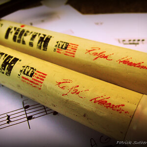
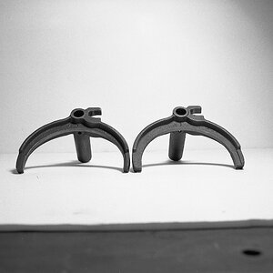
Thoughts please. I dont know what I think of these.

cronullaboarders2.jpg


cronullaboarders.jpg
 
Oh! I much prefer the bottom one. Too bad the surfer got cropped. His head also blends into the dark part of the swell. I really like the angle, though, and the distance compression from the telephoto.

On the first one, I would crop in tighter. Maybe a little bit on the sides and come up on the bottom. I'd lose about half of the sand, as it's a bit of dead space. I'd probably crop in a little tighter on the right than the left, but not drastically.

Nice!
 
I like the lines and angles much better in the bottom one, but the tip of the board getting cut off is a drawback. What about either a more vertical crop to focus just on the righthand guy, or go crazy with PS and clone out the lefthand guy completely? :D
 
Gotta agree here- composition is better on the second, except for the board being cut off.

Was me I'd crop the top one just under the big clump of seaweed to get rid of the tracks. Then look at it with the seaweed cloned out and with it left there and what's what.
 
Shark said:
I like the lines and angles much better in the bottom one, but the tip of the board getting cut off is a drawback. What about either a more vertical crop to focus just on the righthand guy, or go crazy with PS and clone out the lefthand guy completely? :D


Mmm... I like this idea. It almost seems like the pictures are a little dark for as playful as the scene is. Thats just my opinion. Not a bad shot though.
 
I think both have excellent composition, using interesting lines. I prefer the top one because of the awesome reflections.
 
Personally, I also prefer the first, and this because I am happy that here both the boys' heads are in the light, thus their bodies contrast better with the light water in the background. I'm not too happy about the one boy's head "blending into the dark part of the swell".

I even like the fact that the first photo is so large around the two little surfers, makes the vastness of the sea they're about to through themselves into with their boards even more obvious.

And I, too, love the reflections!
 
In the first pic the characters look as though they're wearing tutu's.
 
Manda, both photos are good works. I will say the first one, is the one I prefer of the two. The only suggestion would be to have a lower angle, so instead of the torso being at the point of break, having the knees and lower legs at the break. You would of also got a tad bit more reflection in the receding water.
 
I find the photos to be interestingly (is that a word?) lit and framed!!! I know from experience that it stinks when the sun starts setting and you can not play anymore.
 
Thanks everyone.
The board being lost annoyed me too, but they were running, I was lucky to get them unblurred, let alone completely in shot lol

I must say I think I prefer the first for the reflections and silverness of the water on the sand, but I think I prefer the playfulness of the boys in the 2nd.

Thanks kids. :sillysmi:
 
hey mandapants :D

I must say I think I prefer the first for the reflections and silverness of the water on the sand, but I think I prefer the playfulness of the boys in the 2nd.

yeah, i was going to say the reflections on the first one are choice, sis! Looks like everything was already said about them that I would have said. glad to see you are posting your pics! Was this at Bondi or Manly beach?
 

Most reactions

New Topics

Back
Top