take a look

TheCatch22

TPF Noob!
Joined
Dec 23, 2006
Messages
71
Reaction score
0
heres another one of my pieces, i would like some opinions on which you guys like more the first or second

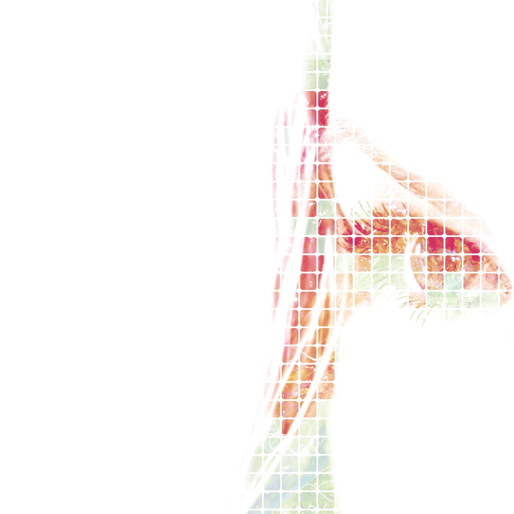
337004163_024eaf5e5e_b.jpg


337004162_95fb182a83_b.jpg
 
i like the blue eye on the first one

the second one looks good as well but its just something about the first one that i like better
 
I'm gonna say number one because the graphic design still allows me to know instantly what I'm looking at whereas number two makes me work for it...And I'm lazy!!
 
im torn between the two as i am much of my work, in the first there is focus but in the second the vibrant colors are much more appealing and i think that in the first there is too much contrast guess im going to have to keep chippin away at it
 

Most reactions

New Topics

Back
Top