The Placid Mansion

Nikon Fan

TPF Noob!
Joined
Nov 2, 2004
Messages
3,524
Reaction score
49
For better critiquing purposes I thought I would post this before the pic:

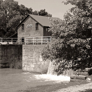
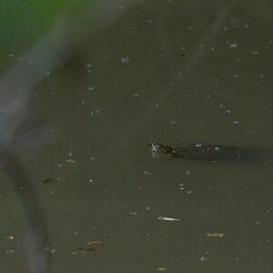
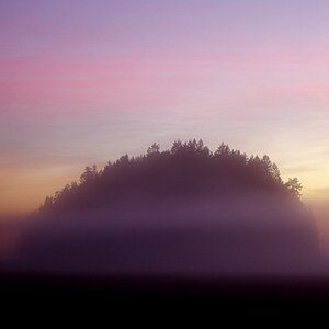
1. I made this picture because it was a striking seen that evoked much feeling and thought when I saw it. I had to stop and turn the car around, walk across the highway, and make the shot with cars flying by at 60 plus mph while I stood there thinking about everything.
2. The simpleness of this scene caught me, as well as the beauty surrounding it. But even more so was the fact that here, just feet from this crazy highway was a look at the simpler things. When folks would go outside and fish for hours on their dock without cars passing them by never thinking or stopping to look. To me this was a look into the past, and realizing how things could be so simple if we let them.
3. Now for the picture and critique. The only way you can hurt my feelings is if you hold back the truth.

IMG_2080webedit55.jpg
 
Lovely composition, but it looks like you shot through a yellow filter. Was that intentional?
 
It's actually a warming filter added in PS. The greens were nice but needed to be toned a bit.
 
the truth is i love it, the composition and tone and everything! it's hard to beleive there is a raging highway nearby, so tranquil looking, and i would have took the same risks for a shot like that, nice work amanda!
 
"But even more so was the fact that here, just feet from this crazy highway was a look at the simpler things"

did you get a shot that included the highway, maybe you could capture this thought with the highway included, i dont know

the sky is a weird color to me, probably the filter, and for some reason i dont like the tree on this side of the lake/pond-its distracting to me although i know there is nothing you can do about the tree being there

i definately think you've captured the placidity of the place :thumbup:
 
Thanks for the comments dalebe, arty, and andreag.

Arty, I played with the saturation for more vibrant colors but it kept seeming overdone to me and took away from the mood. I posted a few of these shots last week, one had really bright greens and reds, but it didn't really seem to work well here. I will definitely play around again though and see if I can figure something out :)

Andreag5- I didn't take a pic with the highway in it. Guess I should have just to show the differences. I live within a distance where I can go back here sometime and I will try to work it out then :) As far as the sky color goes, it is the filter, I could tone it down a bit though...the sky was a really pale bluish color so this seemed to work better for me. As far as the tree goes I sort of liked it. It seemed unique and added to the surrounding area IMO. The tighter shots I have of this same scene eliminate that though :)

Thanks for all your honest opinions and suggestions! Keep em coming!
 
Very nice!!
 
It IS a beautiful scene, no wonder you were so drawn to it. :thumbup:

But....yellow sky...? :( As soon as I saw that, I started thinking the whole image looked too yellowish/green. Probably the filter, but I don't know why you'd think it was needed here. A landscape this lovely could stand on its own.

I'd have been tempted to walk to the water's edge for some shots closer in. Was that even possible, or was there a fence?

Are there more you're going to post of this scene? Would love to see them! :)
 
Thanks photong and Terri. There was a fence and hill that prevent getting closer. I applied the filter b/c the regular colors were just bland to me, and I always like to have nice colors (just personal preference) even in the winter. Here are three others, one is the same scene w/duotone applied (forgive the PS work done here, I did each using different techniques for experimentation)

IMG_2086web.jpg


IMG_2080web.jpg


IMG_2081webbw.jpg
 
One of the most relaxing photo's I've seen in a long time. Thanks for sharing.
Danny
 
okay here is my honest critique, i squeezed out everything i could :)

i like that last bw one, and the sepia is nice, but i think the color ones have too much green or yellow (maybe both). all the trees make it seem busy to me. it may be just me, but the first color one seems a bit crooked (left to right tilt). it's a very peaceful scene, but i think some more interesting crops would fit it well (i like the last couple you've posted). i think the reason the colors are like they are (aside from the color warming from PS) is because the picture was taken in the middle of the day. the same shot at sunrise or sunset would be very beautiful. love your stuff amanda, this is probably one of the only times i'll be able to critique your stuff like this :shock:.
 
Thanks everyone for putting time and effort into critique. It has really helped me to process and better shoot in the future :) Thanks agian!!!!
 

Most reactions

New Topics

Back
Top