tpe
TPF Noob!
- Joined
- Nov 18, 2005
- Messages
- 964
- Reaction score
- 12
- Location
- Copenhagen Denmark
- Website
- www.scientificillustration.net
- Can others edit my Photos
- Photos OK to edit
There are so many of pictures of these guys about at the moment, so sorry to add to the load. Is this picture far too red? or does it just loose it because not enough of the beetle is visable because the shot is from the front.
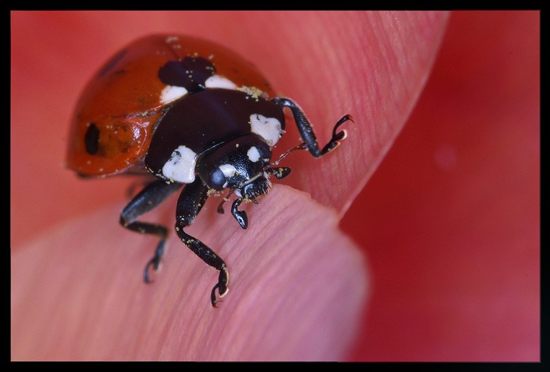
Thanks for looking
tim
Thanks for looking
tim
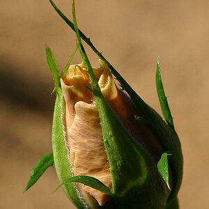
") (specifically lillys) so had to agree with her (this time of my own accord
(specifically lillys) so had to agree with her (this time of my own accord 

![[No title]](/data/xfmg/thumbnail/37/37105-0f1ebcc8381303893e9a7ce0764e86fe.jpg?1619737882)