Website critique

Peakapot

TPF Noob!
Joined
Oct 30, 2015
Messages
79
Reaction score
10
Can others edit my Photos
Photos OK to edit
Hi there guys,

I have recently created my own website. I made it myself and all the images are my own. It is still really new but I'd like some opinions on the layout and images shown. All good and bad points welcome. If you only see bad then let me have them. I'd also like any hints or tips on any features I could add or take away. Thanks for the help.

Peakapot Photography


Dan
 
Last edited:
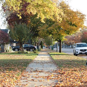
The truth....Its very boring. Maybe its just my computer, but is there no slideshow? I looks like there should be other photos scrolling, but only the photo with the leaves is there?

If thats how its suppose to be. I highly recommend putting in a slideshow, highlight your top 5 or 10 photos.

But the rest of the site is just your "typical boring templately photography site". Nothing sets yours apart from the rest.

With that being said...

What I did like was the fact that you have multiple galleries and clients photos. So it looks like you actually get a lot of work and do good work.

Nothing is worse than trying to sell yourself with nothing to back it up.

You're on the right path, keep it up.
 
Thanks for taking the time to look. I actually had a gallery on the front page but removed it and put a single photo due to advice from someone else (not a photographer). I change this photo regularly and it just happens to be on the leaf photo I took recently. I can easily put it back to a slide show so will look into it. Thanks
 
I don't like slideshows or lightroom scripting etc personally. General suggestions: only show your very best images. Don't duplicate any images across 'albums' or website sections. Avoid coming soon components on the website. Design a site optimised for smartphones/tablets if it isn't already. Ambiguity: Comments (no comments), Photos for Sale: hobby/business mix? Concentrate on the core business, core message right off the bat. Typos and proof reading needed, e.g "If your looking for a fun".
 
On a Gallery with this computer I can see the main photo and the top edge of the row of other selections but to select another large photo I have to go down to it - click on it and then go back up. There should be arrows to move through the selections.
Second the comment that only YOUR ABSOLUTE BEST and no Under Construction.
Also Boudoir and Family for many people don't belong on the same page...
 
Your website doesn't appear to respond to different sized devices.
I use this website to simulate devices and different screen sizes: Screenfly / Test Your Website at Different Screen Resolutions
I think having your contact information "below the fold" on each page is going to work against you.
You are relying on visitors being "engaged" enough to scroll down there.

I would suggest considering a "Contact" link in your menu/navigation bar.

Similarly I would have an "About" link in your menu.
You about info is scattered with "we", "we" .... but you only include YOUR name at the bottom.
Again, think like a visitor ... am I looking at one person business or a partnership?

Your menu bar/heading/social icons take up quite a bit of vertical screen space.
For example, on my 15.4" laptop screen, just this element takes up one third of the vertical space
Maybe think about reducing the size of the website name, reduce the top margin/padding and moving the social icons onto a single line?

Company information? Couldn't care less if you are a sole trader or fully insured. I'm assuming that. I don't look for that went I go onto a Apple site. Think more like a visitor to your site rather than as the site owner.
Look to introduce features, links, information, navigation that a visitor needs to stay on your site.

I would agree about the "Photos for Sale" - if it is not ready to go now ... don't have it "live"

Have a think about whether you want to include information about what you offer and pricing. Some people can't be bothered emailing to find out if you are in their budget.
Do you offer prints (size), albums, digital files (sizes), package deals.
Can I organise short sessions, longer sessions?
How far are you willing to travel? So am I wasting my time even considering you if I live in the next county or further.
Try to think of all the questions a visitor might have and see if you can provide that up-front. You might not include some info so that you can up sell products or explain packages with examples in person.
 
Last edited:
Thank you everyone. Some excellent points I had not even considered.

With the family/Boudoir combo I have already decided to create a separate website for Boudoir as that point has been raised all ready.

AceCo55 I have never heard of this screen fly so I will definatley look into that tonight thank you.

Regarding the info on the page i think an about page is a great idea. I didn't want my front page to be too cluttered so cut down alot of stuff.

There are alot of points been raised so I will go through each one inturn and see what improvements can be made. Of course I will let you all know when the work is done and you can take another look and let me know if it is getting there.

Thank you all.
 
One point that has confused me is Xenskhe saying there are no comments. When I go to the comments page I can see comments. Does anyone else not see them?
Screenshot_20160302-065813.png
 
I agree with the previous comments.

I saw the comments. It did take a few extra seconds for them to load.

If you are trying to bring clients via the search engines, you might want to read my SEO for the Photographer link in my sig.
 
@AceCo55 I have tried using that website to simulate different size devices and you are correct it doesn't respond at all. However if i view the site on actual physical devices it responds and changes just fine.
 
@AceCo55 I have tried using that website to simulate different size devices and you are correct it doesn't respond at all. However if i view the site on actual physical devices it responds and changes just fine.

I guess that is a limitation of a simulation - very glad your website dynamically responds to different device.
All good then on that front. :1247:
 
Everything feels compressed on the home page. Poor grammar. Gallery link not working. You need a logo. Think about brand.
 
@jcdeboever I have nearly finished the revamped version so it will be up soon. I'm interested to know what link did not work for you?
 
@jcdeboever its a drop down menu mate. If you hover over it the pages will drop down and you can pick one.
 

Most reactions

New Topics

Back
Top