Which One

jerzegurl

TPF Noob!
Joined
Jul 16, 2010
Messages
8
Reaction score
0
Location
New Hampshire
Can others edit my Photos
Photos NOT OK to edit
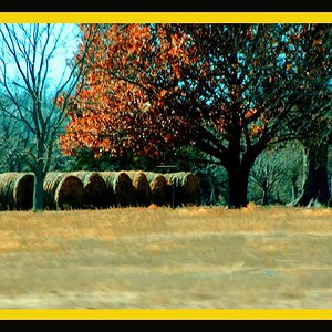
I was wondering which picture is the better black and white. I know what I think... but would like some imput.

Thanks. And also thanks for your help and patience while I tried to get these pictures up.

Tracking.jpg


Dillon5.jpg
 
Last edited:
If I quote your post, some sort of code shows briefly - but it's gone before I can tell what it is.

To post pictures, do this:
 
I think the link is bad. I use Vista ... to edit on.. Will try something different..
Thanks..
 
I use Vista ... to edit on..
Vista, as in the OS? I don't think that's the problem here... I'm running Vista too, it doesn't affect my editing or uploading at all...

Where are you hosting your pictures?

I think you probably just copied the wrong thing for posting here. The HTML code won't work.
 
Okay, I don't know why my photos are showing up. They are in my gallery. I am sorry. I don't know what I am doing wrong. I have published pictures in forums before (not this particular one)..

Any suggestions?
 
Right click on the picture. In the menu that comes up, there should be an option to copy the image address. Copy that.

Paste it inside the 'IMG' tags.


That should work.
 
Finally!!! I think the problem was I had two http:// when I pasted the link in the box.
 
Finally!!! I think the problem was I had two http:// when I pasted the link in the box.
Ah. Yeah - I think it automatically puts the 'http://' in there. Sometimes when you paste the link in it overwrites that, sometimes it doesn't...


OK, onto the pictures...

I think I like the first one more, it seems to have more contrast. They're both very similar though.
 
Thanks Josh... I know they are similar they are the same picture just edited different. I like the higher contrast also..
 
Very subtle changes. I feel like I'm doing one of those "Find the 5 differences" kid puzzles.

I like the tones in the shirt better on the first one, but I like the slight DOF in the second one helping the figure to be isolated from the trains. Compositionally, they both suffer from leading lines that spill off the right side. Repositioning the figure would help that. They're both a little contrasty with the black getting clipped in the under shadows of the trains.
 
Thanks oldmacman, that black bothers me too and I agree with you about the tones in the shirt. In color the shirt was a light gray, perhaps I should have put him in a different shirt :) But I have to confess ignorance on what DOF is.
 
Number 2 for me. I think the background trees are too light and are washing out in the 1st but in the 2nd they sit better within the frame and also obscure that aerial a lot more.
 
Thanks oldmacman, that black bothers me too and I agree with you about the tones in the shirt. In color the shirt was a light gray, perhaps I should have put him in a different shirt :) But I have to confess ignorance on what DOF is.

Sorry, I tend to over acronym. DOF = Depth of Field. In the second one the background is starting to go out of focus (OOF) which helps to draw attention to the figure and counter the compositional movement.
 

Most reactions

Back
Top