
gsm275
TPF Noob!
- Joined
- Mar 24, 2010
- Messages
- 108
- Reaction score
- 4
- Location
- Vancouver, BC
- Can others edit my Photos
- Photos OK to edit
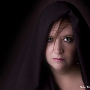
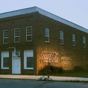
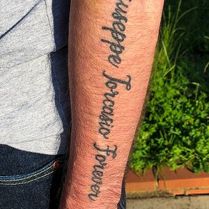
Working like crazy trying to sharpen my composition and creative skills. Would love some constructive feedback!
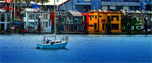
Pic 1
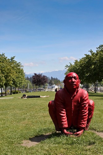
Pic 2

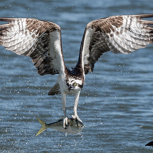
Pic 3

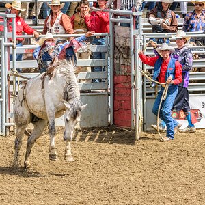
Pic 4
Pic 1
Pic 2
Pic 3
Pic 4

![[No title]](/data/xfmg/thumbnail/33/33874-2ac673051e59157729970fcb9b637b43.jpg?1619736180)

![[No title]](/data/xfmg/thumbnail/33/33876-69ae4c2723e06d63117dc3b1b6629647.jpg?1619736182)

![[No title]](/data/xfmg/thumbnail/32/32926-ec27ecead8c80d803404500d8f888dbf.jpg?1619735754)
![[No title]](/data/xfmg/thumbnail/33/33875-e155733428c9a8d5f34bbc19e80e29a6.jpg?1619736181)