LCARSx32
TPF Noob!
- Joined
- Jun 8, 2010
- Messages
- 641
- Reaction score
- 3
- Location
- Cedar Hill, Missouri, USA
- Website
- www.lcarsx32.com
- Can others edit my Photos
- Photos OK to edit
I've had SLRs for a few years now, but only recently got into the more advanced settings (I relied on "green" mode waaay too long). Here's some shots I've taken over the last 6 months or so. I would appreciate any constructive criticism you can give. I'm very exited now that I've found this site. Thanks! -Ray
*Edit*
I had 24 pictures here, but I began to think of the nightmare if you wanted to comment on any of them, so I've slimmed it down to the top 6.
*End Edit*
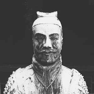
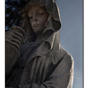
#1

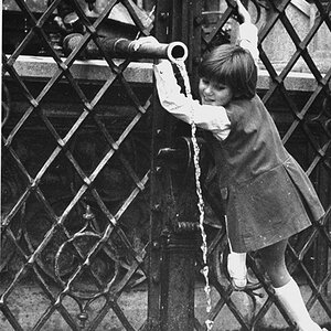
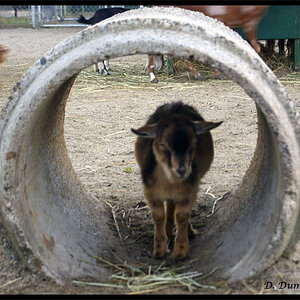
#2

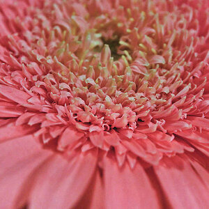
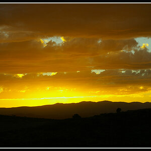
#3

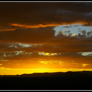
#4

#5

#6

*Edit*
I had 24 pictures here, but I began to think of the nightmare if you wanted to comment on any of them, so I've slimmed it down to the top 6.
*End Edit*
#1
#2
#3
#4
#5
#6
Last edited:
")
![[No title]](/data/xfmg/thumbnail/37/37540-73002ccb910b97978bc38658622a34d3.jpg?1619738133)
![[No title]](/data/xfmg/thumbnail/35/35270-a66987e049fb56c03e604b4c77910b81.jpg?1619736972)
![[No title]](/data/xfmg/thumbnail/32/32929-22e23acc63d6ecb25e5ee941be87121f.jpg?1619735758)