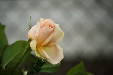
I like the first one better. The colors are warmer and more inviting. Two things I think would improve it would be to adjust the contrast/brightness and clone out the stem thats sticking up right behind the flower.
I wonder if there is something in the middle (as in between shot 1 and 2)...2 seems too desaturated to me or just looks like it from really cloudy day? 1 seems cool but the blown highlights get me. dont like the framing, not sure why..but placement of flower seems off. I do like the blurred lattice in the background...gives me an idea to get some...I don't think I have shot lattice in background yet.

-19.jpg")


![[No title]](/data/xfmg/thumbnail/31/31980-e5048a424621c7b3cd0d306d63c09d67.jpg?1619735137)