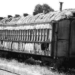
Very nice, the 4ths my fave, the desaturation on the bacground works well, even though i am usually against manipulation like this it looks interesting and sharp. BTW Why the danish flag in canada?
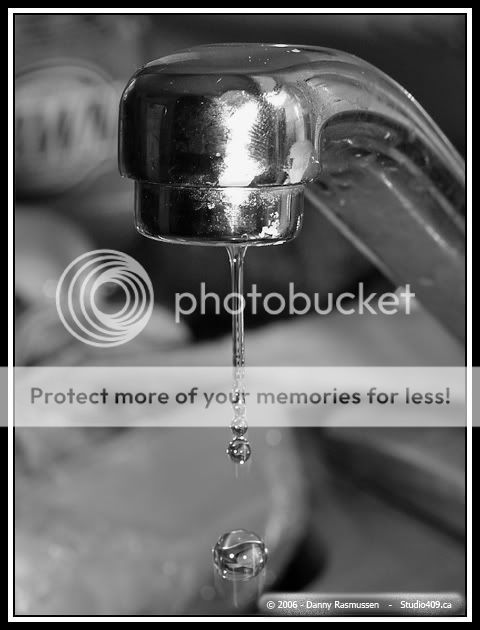
Cool drop, to begin with.
Cool conversion into B+W! No doubt.
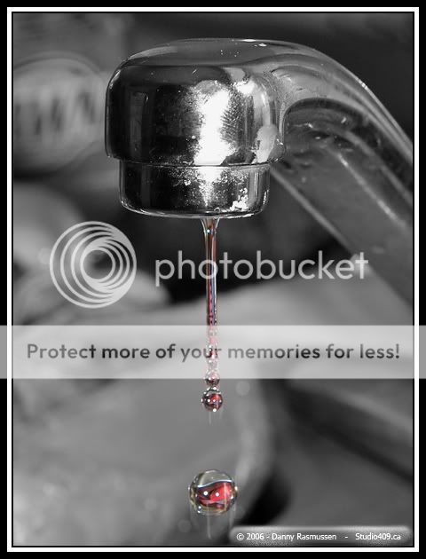
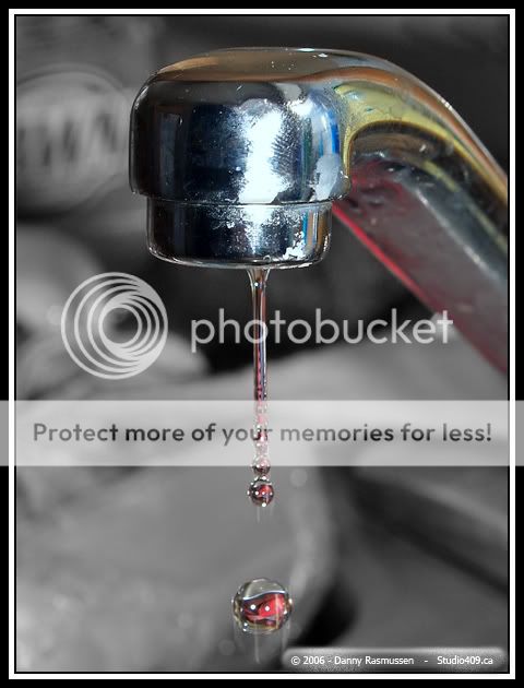
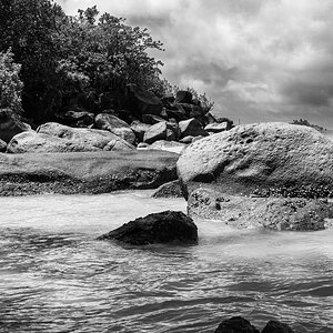
Cool selective colouring, I got more and more impressed the further I scrolled down.
Absolutely coolest selective colouring. In my eyes by far the most interesting version. You got my vote for 4!
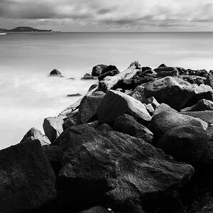
Thats a beautiful shot there!!! Could you advise on the settings you had on your camera to take those photos? I love the third one! Its a charm! I can actually see something that resembles a(n) fingerprint if i'm not mistaken?
Focal Length = 45mm
Aperture = F/10
Exposure Time = 1/160 sec.
ISO = 100
Exposure Compensation = 0 step
External flash was used <---
Everything was done Manually
Thanks everyone for their votes/comments... both #3 and #4 seem to have equal votes (9).. it's gonna be tough to decide which one to keep
I like #3. The background in the colour version is too busy. The all black and white doesn't define the water as much as I'd like. #3 is just right.:thumbup: :mrgreen:


") I'm just living in Canada with my family for the moment (business related). I'm moving back this summer.
I'm just living in Canada with my family for the moment (business related). I'm moving back this summer.

![[No title]](/data/xfmg/thumbnail/42/42397-30faa170de7ed9be38adf00b9b26a220.jpg?1619740167)

![[No title]](/data/xfmg/thumbnail/34/34064-66d345cd6eebe4b9f97597e03008d3b7.jpg?1619736260)
![[No title]](/data/xfmg/thumbnail/34/34061-e097813b3719866d07ff3e78e8119ffa.jpg?1619736258)
