What's new

#1535

Bitter Jeweler

Been spending a lot of time on here!
Joined
Apr 27, 2009
Messages
12,983
Reaction score
5,003
Location
Cleveland, Ohio
Can others edit my Photos
Photos OK to edit
.


8214401213_aea9a957bc_o.jpg
.
...........................U Like?​


.
 
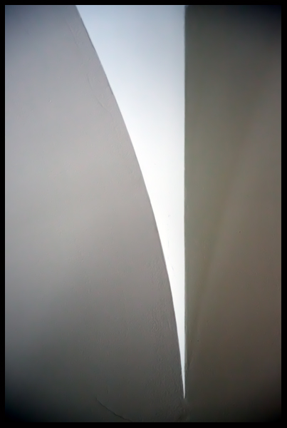
Some have said the point should touch the bottom of the frame. I prefer the flow of space around it.
The more I look at it, the more I think I should clone out the crack in the plaster at the bottom-left.

This image has a somber tone to me. What was your gut reaction to it?
 
Reminds me of a lady unzipping her dress. Agree with not having the white touch the bottom and cloning out the crack. It's goo to have the tip of the white have some room to breathe.

Not somber to be but then again I am a half full guy.
 
Reminds me of a lady unzipping her dress.

Interesting interpretation. I see the nib of an ink pen.

I am often on the fence with cloning. While I don't have a problem doing it, the other part of me wants to keep what's there, as an indication of what his "is". The crack, and the little bits that look like posterization/artifacting which are actually just "bad" drywall work, ground the image in reality. But is that what I want?
 
I don't SEE a crack anywhere in the bottom left portion. Sometimes, my vision is its very own cloning tool. :lol:

I love the simplicity of this. I think I'd like it just as much if the point came all the way down, but it would be an entirely different image. The way it is seems to draw me into the image more, somehow.
I saw the same "zipper" thing as runnah initially--not a lady unzipping her dress, just a zipper in general. But now it seems more like a page curl on a book.
 
remove the vignette.

zOMG...I was thinking the same,exact thing...welllll, "almost"...I was wondering if maybe dialing the vignette back might not make it even better...just seems a little bit too obviously vignetted...especially on the upper right corner, where the vignette really seems like a post-capture vignette pre-set. Contrasting the top left corner with the top right corner, the heavy vignette on the top right just makes the left corner look,well, "weird". The top left corner has almost no vignette, but the top right has like a -3 stop fall-off...I find that to be just too much of a disparity in a photo that is based upon subtlety and elegance...it looks heavy-handed...
 
I don't mind the vignetting - but them I'm removing all my lens vignetting correction lately, so maybe it's just my current frame of mind.
The crack should either go or be more prominent. It's just wishy-washy as it is. Make up yer mind! ;)
This may be my monitor, but I'm getting some yellow-green coloration in the right side that doesn't really fit - if it's actually there.

I see a pen too.
 
I really like it! I agree about leaving the space at the bottom. I'd like to see it without the crack.
 
$crackiswhack.webp

Boom.
 
Reminds me of the heroin needle of indifference. Slowly sinking down into darkness and not making an attempt to pull up out of it. Thanks for sharing this with us.
 

Create an account or login to comment

You must be a member in order to leave a comment

Create account

Create an account on our community. It's easy!

Log in

Already have an account? Log in here.

Back
Top Bottom