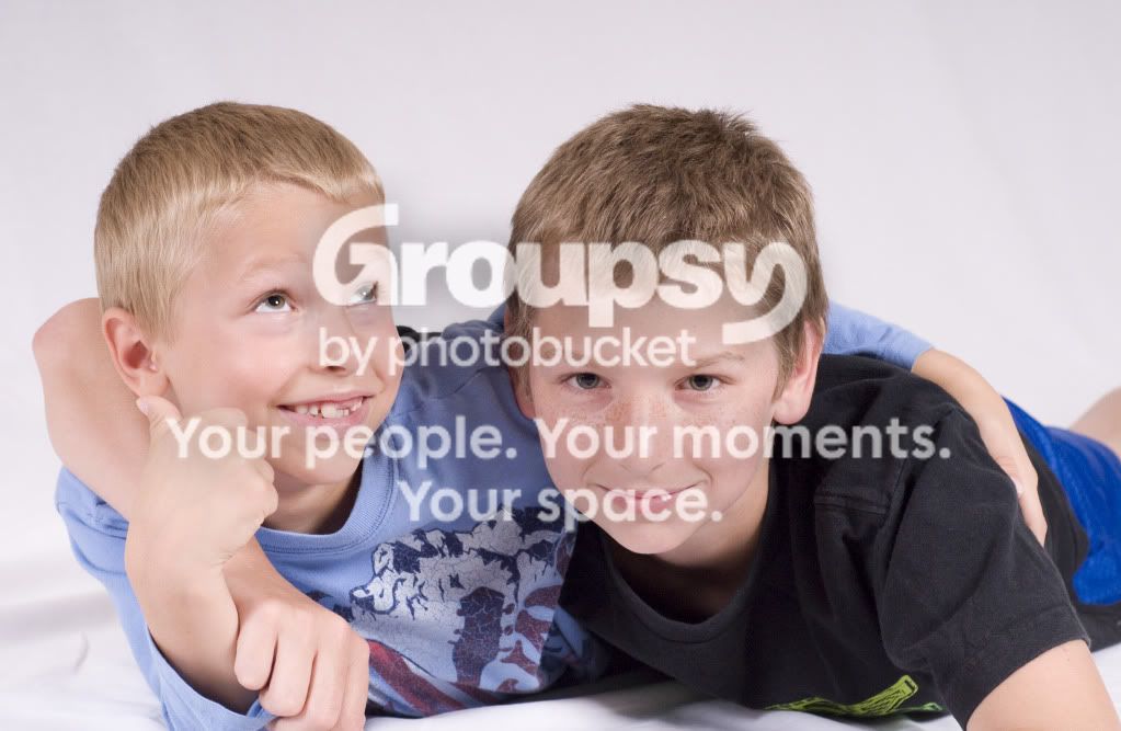
The lighting wound up looking moderately flat. Were you balancing with a lot of ambient light? I can see where the lights were, and the placements generally look fine (I assume you're pulling them out of the book) and the light's flatness is a little surprising. No catchlight in #1 in the boy on the left, which is unfortunate. All poses of the boys the light seems a little high to me (obviously since they're low!) so you're getting a little shadowing under the eyes. The overall appearance of flatness makes this a lot less unflattering than it could be, though.
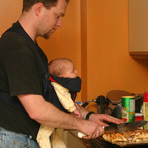
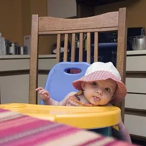
The baby looks ok, but she's lit almost from the front in the first, and not quite so much from the front in the second but then you have the fill making it look almost frontal.
I'd say you're overfilling the shadows, at least for the baby, and for the solo shot of the boy. Not sure what's going on with the first two if it's not lots of ambient.
Anyways.
The flatness is definitely a "look", it happens to be one I don't much like, but that doesn't make it wrong. It is what it is, and some people probably like it quite a lot. My major recommendation, if such is what you'd like to hear, is to be more aware of catchlights in the eyes. Some of the two-light setups created a somewhat strange look, and as noted the catchlights are completely missing in at least one.
These are a great early effort, though! Let me not be discouraging, there is much here that is delightful and good!








![[No title]](/data/xfmg/thumbnail/34/34692-a218056da5698d6c9b7cf734f656562d.jpg?1734165698)


![[No title]](/data/xfmg/thumbnail/39/39181-9016b4d45a06d288c1a2b92565ba7837.jpg?1734173055)


![[No title]](/data/xfmg/thumbnail/39/39182-efc21fe87c9b5f9b2fa9ab0f8f01c205.jpg?1734173056)