I edited these pretty majorly, which is NOT what you should do, but I think they better approximate what some better choices in studio might have looked like, which I outline below alongside the comments about edits.
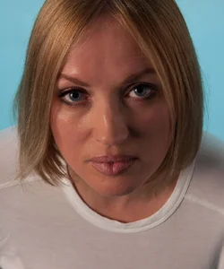
Here's my edit of the first one:
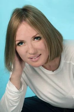
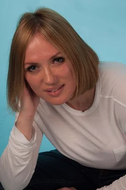
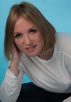
and the second
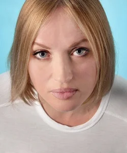
Things I did:
1) Severely underexposed originals. Had to brighten both by several stops probably. Looks fine in a thumbnail, but printed, these would have issues, because brightening too much loses data and causes posterization. Expose more in-camera.
2) The face was comparatively dark with the rest, which had to be reversed, so selective lightening to faces only (this should be done on scene with lighting though)
3) The detail on her face was really harsh and unflattering, probably the light was too far off to one side. Doing that highlights texture, which most women don't want you to do. For men it's more often good, but still generally only if you want a rough and tumble sort of look, not for a glamorous well groomed pretty boy. I did a lot of clone stamping at 50% opacity to smooth out the texture a bit again. If you must edit it in PP, 50% clone is a great tool, because it majorly softens, still looks natural, and doesn't insult the model, because you can still see all the wrinkles and features, so it doesn't look like you were editing things out.
3) The lighting was harsh - a single point source almost, leading to harsh lined and edged shadows. You need a diffuser, like an umbrella or softbox on you light. I clone stamped out some of the worst areas.
4) The white balance was really off on both, in different ways. I couldn't really get them to match up, though I tried. Shooting in manual mode in a studio helps maintain coloration consistency across shots, because you get it right once, and the lighting situation isn't changing, then you just don't touch anything. And if you want to adjust color later, you can do it as a batch process equally on everything. Thus all the photos would look the same color and lighting, unlike here.
5) The side lighting also highlighted every larger scale bump on her face and made some weird nose shadows, etc., which I either cloned or used dodge and burn tools to even out a bit.
6) The wardrobe here is pretty terrible. Flimsy white t-shirt doesn't look too classy. It's also transparent and shows up as pink from her skin underneath, which I had to fix in the second one by selecting the shirt and desaturating and brightening.
7) I brightened and sharpened and contrasted the eyes more, which is not really an in-studio thing, I'd always do that in PP.
8) Recropped a bit or cloned out creases and slivers of arm, but could only do so much in this regard. Pay attention to your edges and dont' cut limbs down their length or chop off hands if you can help it, etc., or have random bits of sleeve showing.
Things I couldn't edit:
9) Poses are a bit wanting. The second one looks mugshot-y, straight on like that rarely looks good unless you have some really really well done and probably pretty dramatic lighting. Normally I'd only consider straight on if I was either doing a comparison before-after makeup shot or something, or if I planned on making half her face in total shadow (mysterious carmen san diego sort of thing, ideally with floppy hat lol).
10) She looks kind of pissed off in the second one. Don't forget to tell your model how good they look and keep chatting and keep spirits up. Project confidence even if you're panicking, and you should probably tell them to smile more until you get a better hang of poses and lighting, because mysterious/sultry/whatever expressions are harder to pull off in a consistent looking way than a smile is. The first is better, but still looks uncomfortable to me, I dunno.
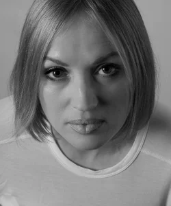
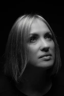
And B&W versions which I think look better together due to the coloration consistency:
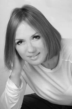
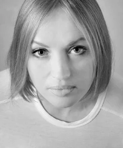
(Just converted to B&W, cranked up reds and yellows a bit, and more dodge and burn due to different things emphasized in B&W)
Still some issues I'm seeing after coming back awhile later. Like the left one is dark on bottom of face light on top, due to my struggles with massively lightening and mucking around with it. Not gonna go back and fix it -- it is a good example of why you don't want to muck around with stuff in PP compared to in the studio when it comes to light.







![[No title]](/data/xfmg/thumbnail/35/35865-5006be46d328277e5a956fa323782d97.jpg?1734167579)
![[No title]](/data/xfmg/thumbnail/32/32716-bd7f0a0030263f160d995f8547043458.jpg?1734162345)
![[No title]](/data/xfmg/thumbnail/35/35957-c79b37130dc06cbdee3b56de92a35fe6.jpg?1734167784)