You are posting in the Pro section so this is going to be a bit stronger of a critique than in other sections.
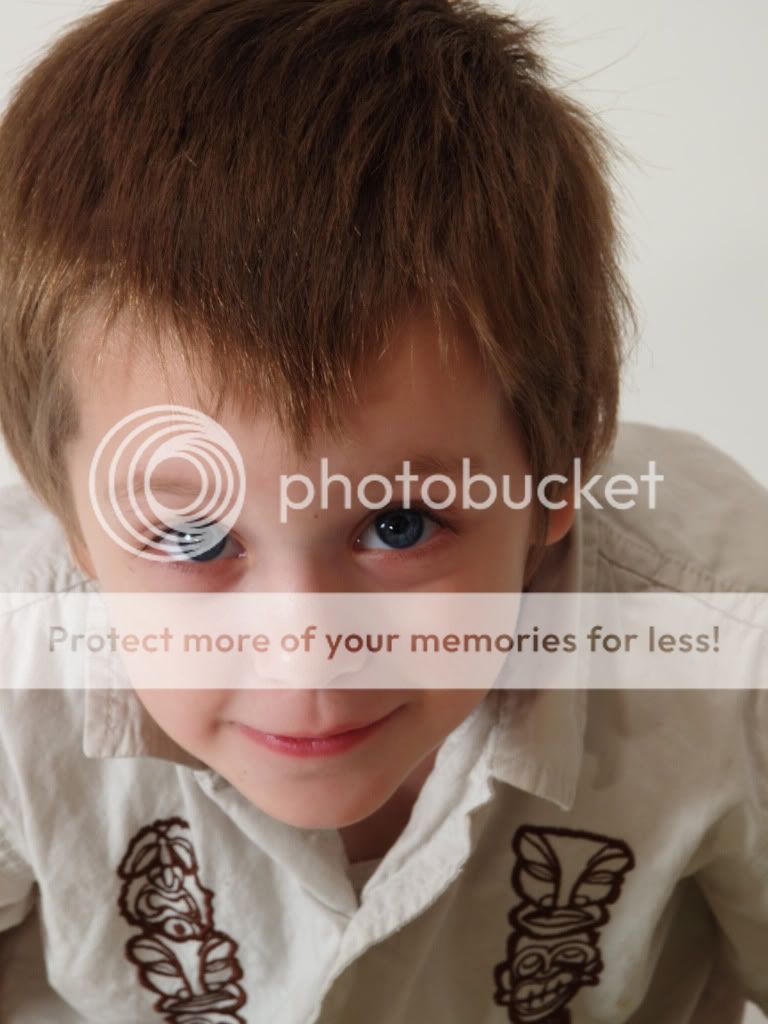
Image 1
I can see the Rembrandt lighting in this but the focus point did not hit the eyes, they are soft when they should be sharp.
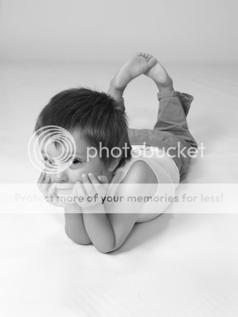
Image 2
This image lacks in a few ways, thing like the underwear showing, the wrinkles in the background and not enough contrast in you black and whit conversion. This looks like you need at least one more light on the background.
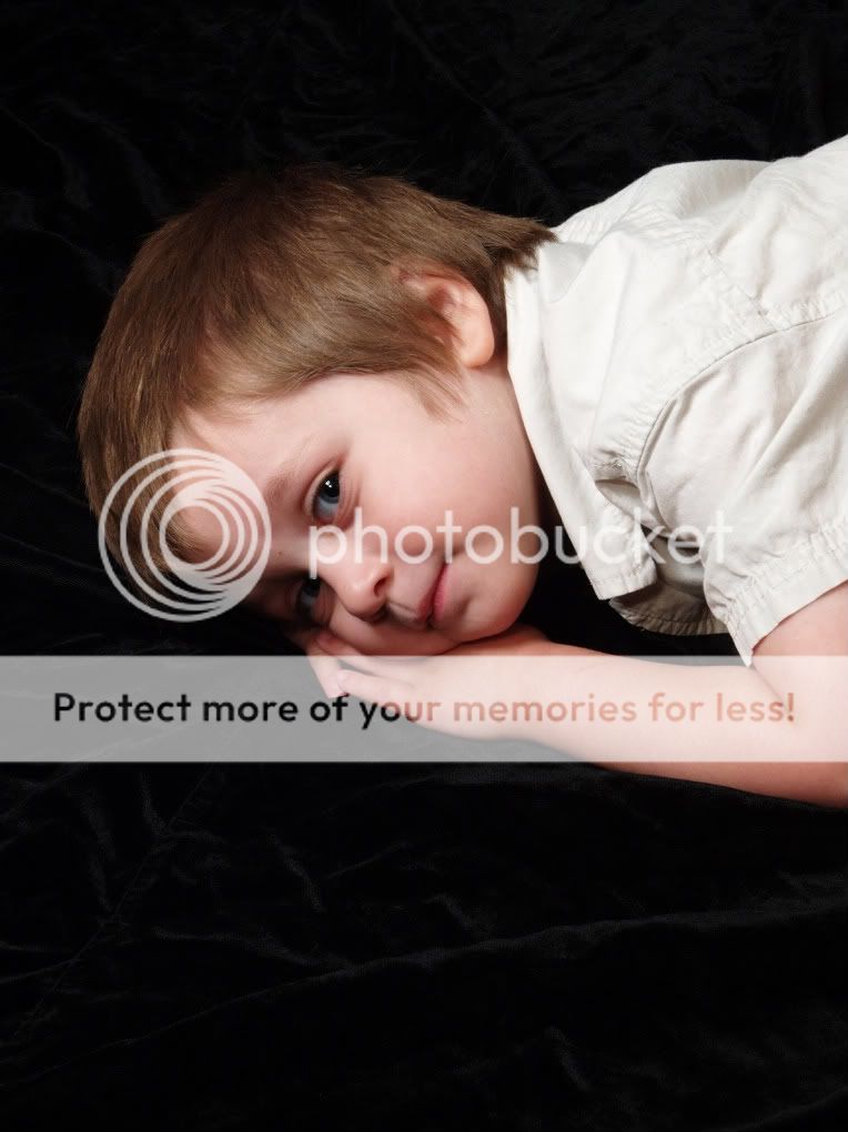
Image 3
This image looks awkward, to me it looks forced and not natural, as well it looks like it should have been shot horizontal, but you lighting looks better on this one.
Image 4
It is a bit too small to tell if it is sharp, but again I do not get the peaceful feeling I think you where going for with this one. It seems like there is a bit to much black space around this one. You subjects head is too centered. (See Rule of 3rds)
Image 5
I like this one, it is fun but could use a bit more light to really make it pop.
Image 6
Without the hand coming in from nowhere this would have been a stronger shot. With no arm attached to the hand it is just floating there. For this type of shot a wider crop would be better. And it looks like you white balance might be a bit warm on this one.
This is just my opinion.


![[No title]](/data/xfmg/thumbnail/39/39657-59afb9b38e439b33906e81e4952470ac.jpg?1734173973)


