Of the two I definitely like the second one a lot more.
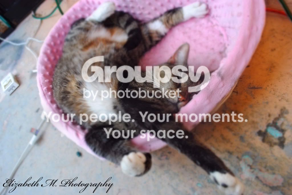
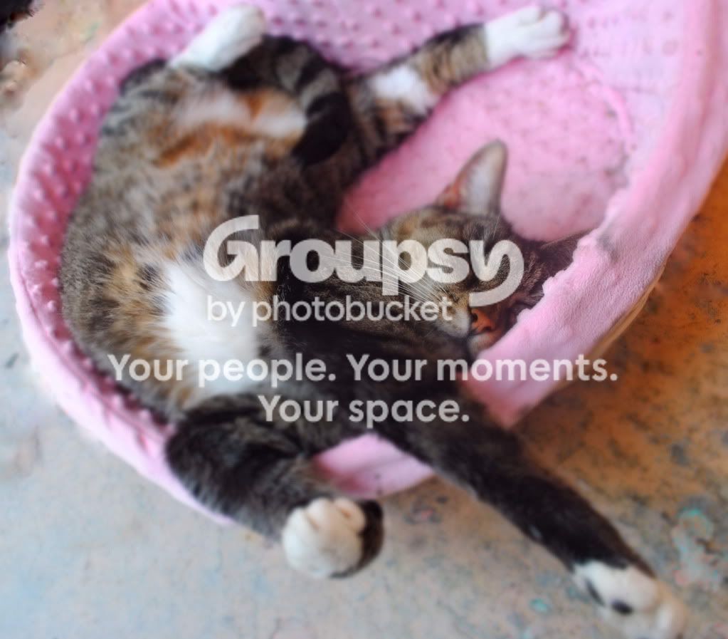
#1 First of all, the image isn't clean, I.E. there are distracting elements such as the cigarette box, the wires etc. Secondly, I'm not really sure which part of the image is in focus. The paws at the front and body at the back are all blurry, but the face of the cat is also blurry. The image would be greatly improved if something was clearly sharp.
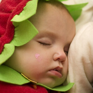
#2, really pretty good, I like how the subject really stands out. That being said, I have a few nits. one is that the green leaf at the bottom of the image is distracting. Secondly, although it looks like you did a pretty good job in some areas with the composting of the images, the are a few spots where the cloning/masking was rather stodgy.








![[No title]](/data/xfmg/thumbnail/31/31046-f1d28c614676726741e90ce5b420a03e.jpg?1734159151)