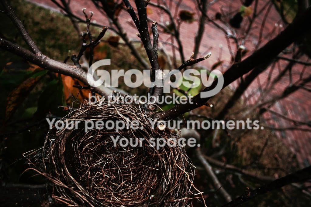
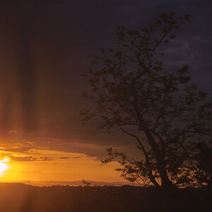
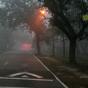
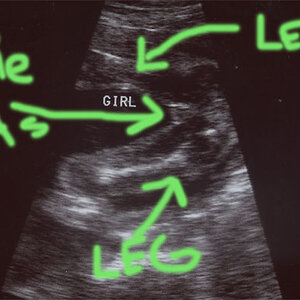
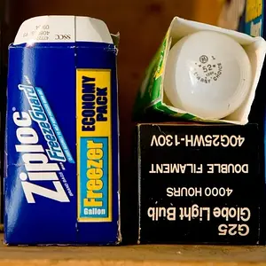
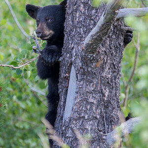
The first looks underexposed. I also find myself asking "what does the photographer want me to see here, and why?" I like how the branches radiate away from the empty nest.
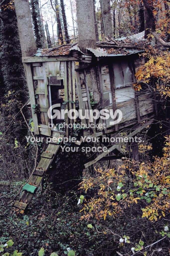
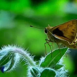
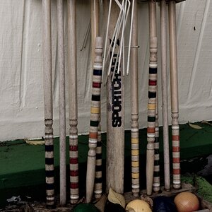
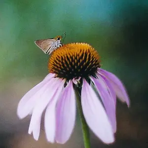
The second has a color balance issue (has a greenish cast), and it looks as if if needs to be rotated a couple of degrees to the right. It might be more effective to concentrate on the details. Maybe take a few tight shots here to see what you can come up with. The foreground elements are a bit distracting.