Here are my opinions:
#1
For me, the panoramic crop does not work. Too much space on both side of the sun. A vertical orientation with more of the reflection would be more interesting, I think. As it is now, there is too much uninteresting stuff going on. The black horizon line can just be so interesting. The interesting part in this image, the sun and its reflection and its rays, take up very little space here, and when my eyes wander to the edges, I don't see anything.
#2
I agree that it should be brightened. Boost the curves a bit, and exposure wise it would be OK. I'm not fond of the composition. The pier is a horizontal line which obstructs the horizon line, and so their (possible) interaction isn't happening for me. As of now, the pier does not work as a great leading line, because it's parallel to the horizon which means it's not leading into the picture. Leading lines can be powerful, but often they add a depth to your image. In this case, it just make the image seem very 2D. Having the pier diagonally into the frame would be better. Based on mentioned points, I don't think the panoramic crop works here as well.
I'm not sure if you wanted C&C on the photos or on your post processing.


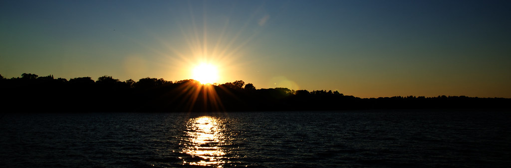 Sunset by Compressed Memories, on Flickr