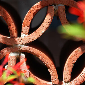
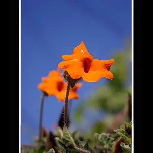
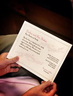
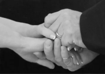
Im going to be honest here. Im not liking any of these shots. Only number 3 has decent focus but it still has issues. Ill go over each.
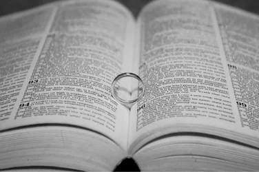
1. Soft focus. Cant read print. Weird angle as well. Like your looking over someones shoulder. Something like this should be part of a collage of little details together. Alone is boring.
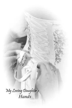
2. Way soft. Dingy gray scale. Just kind of off. Sad cause im a big fan of the "hands shots" like these.
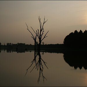
3. Good focus but the framing is killing it. Should have zoomed in tighter and maybe had it a bit off center. And where is the other ring?
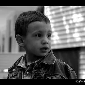
4. I hate vignette used in this way. Seriously hate it. Vignette is a correctional tool that when used properly should never be noticed. Dont get the caption either. next time give some background. Not a fan of printed quotes on photos either. Is that really needed? Its their wedding and they will probably remember who that was. Plus as tight as you shot this it almost looses all context.






![[No title]](/data/xfmg/thumbnail/30/30873-79f4c5bc298110a994e9eed027728db8.jpg?1734158862)



![[No title]](/data/xfmg/thumbnail/39/39187-9ec2507d9e5ef2843f7f00127c7abb4c.jpg?1734173062)