K_Pugh
No longer a newbie, moving up!
 #3 by pughphotography, on Flickr
 #3 (Colour) by pughphotography, on Flickr
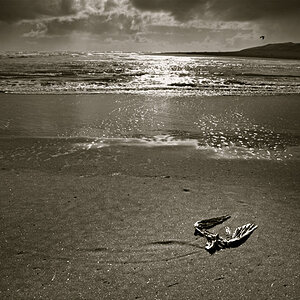
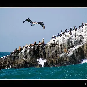
The image was shot in 9 segments and stitched together. I use this method, along with the 1:1 ratio with all my images named "#.." - The main reason is to increase the megapixel count for large prints. They are approximately 36mp, whereas on a 1:1 ratio with the Canon G16 I'd produce images around the region of 9mp. Secondly it can produce a distortion which can be used to my advantage when needed. This particular shot I used a 430ex flash off camera.
Last edited:


![[No title]](/data/xfmg/thumbnail/36/36664-a1f71b488f6761523649a87f8465fc3d.jpg?1734169172)


![[No title]](/data/xfmg/thumbnail/36/36665-7c494bf98537fba5ac87ac5ad6bda658.jpg?1734169172)
![[No title]](/data/xfmg/thumbnail/37/37106-bbbc8e30f409f82c56bead43c7565d5a.jpg?1734169829)