3 for CC

Boomn4x4

TPF Noob!
Joined
Mar 15, 2010
Messages
766
Reaction score
4
Location
Ohio
Can others edit my Photos
Photos OK to edit
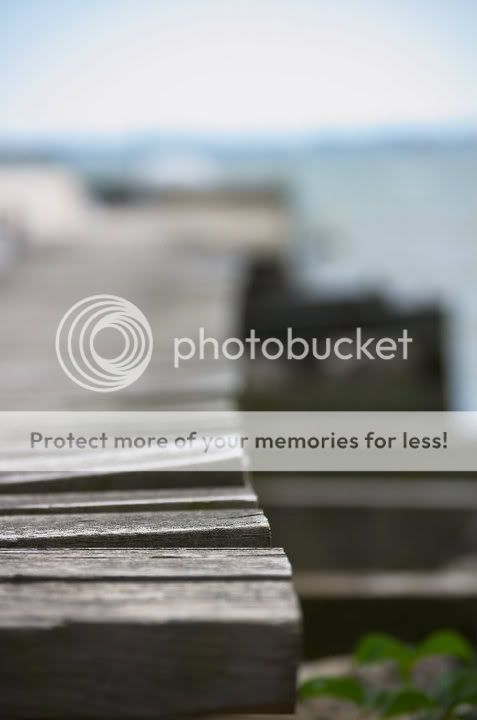
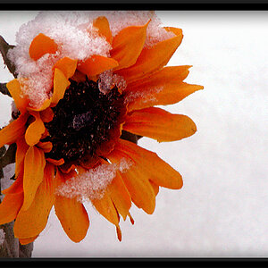
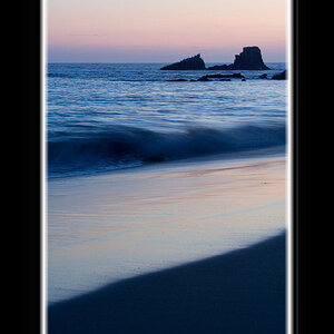
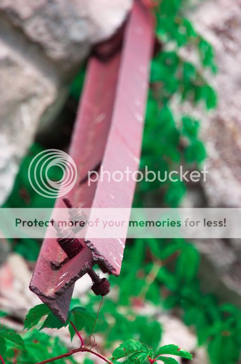
First of all, I downloaded these from my facebook account, the images seemed to have been compressed considerably... specificlly the images seem to have really hard (aliased) edges... so if you can look past this.

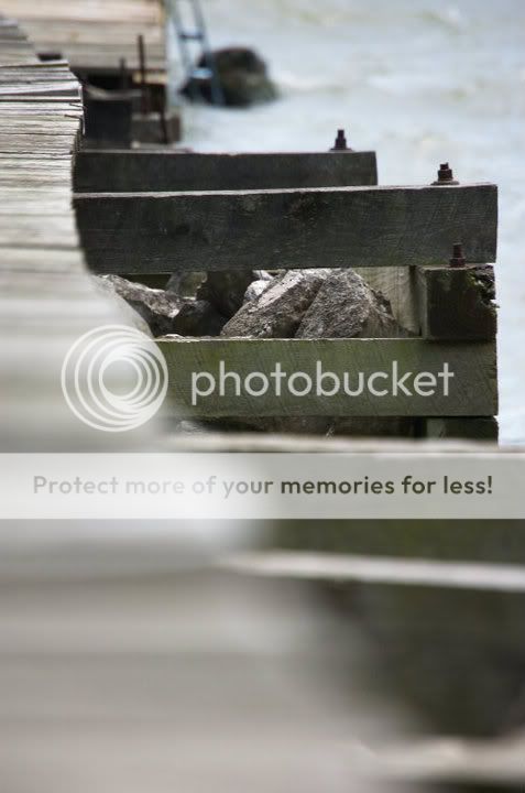
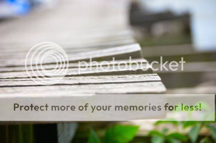
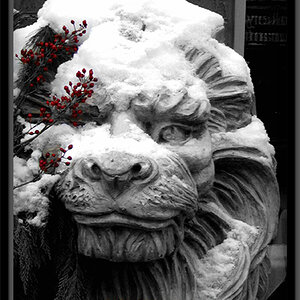
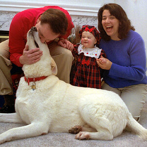
One thing I would like you to comment of most specifically is the post processing. I seem to have a problem of going a little overboard, so I tried to tone it back a bit on these.

Comments please?

7-3.jpg


6-3.jpg


3-5.jpg
 
This thread seemed to slip by me pretty quick!

Anyway, C&C:
1. Selective color adjustments? Looks like those colors are fake :| If they aren't, they seem too saturated. I think the composition could use a little working on as well. It seems as if there is a missing subject here, something that could have a spotlight as the main focal point.

2. I think a closer focus could have helped this one out, however it is just not that appealing to me. The composition needs some rethinking and again it just seems like there is no focal point or subject matter. Maybe getting a little more background and foreground can help this one out!

3. Interesting shot, but more of a snapshot than a made photograph. Feels like a good catch as the car was driving by, but unfortunately you didn't have the time to set up as it was rolling by.

I think they are all good, but just a little bit of thinking about subject matter would help (first two) while in the second one there isn't much you could have done.
 
Comments please?


#1
There is insufficent depth of field. To much of the photo is OOF, or put another way the subject, which is in focus, doesn't have enough scale within the frame. Cropping could address the issue.
The leading line of the I-beam is good, except it leads away from the intended subject, not towards it. As mentioned, the saturation looks overdone.

#2
Again an ineffective use of depth of field. As shmne suggested a closer focal point or having the foreground in focus may have made a more interesting photo. Again a leading line is available, the dock edge, but not used well.

#3
Mid-day, and subjects in direct sunlight don't make for very nice photos unless you have a lot of the right gear and do a lot of prior set-up work.
 
#1. Wasn't slective coloring, just over saturation. I seem to habitually do so, I think the colors look great when PP it, but then people tend to tell me other wise... all apart of the learning process.

Would you care to elaborate a little further on your comments of DOF?

#2.. You mention "leading line"... what is the goal of your leading line? What should I get out of it? What do I want the leading line to do?

Here are two more of the same shot, again yanked from facebook so the image was degraded. Is this more along the lines of what you are looking for?

10-2.jpg


11-1.jpg


#3. It is a snapshot, so I'm certainly not in disagreance with any of the comments there. On this one, I'm more concerned about the PP. As I stated earlier, I have a habbit of oversaturating the colors... do you feel I do so here as well?
 
The DoF of some of your photos is too shallow. In some of your photos the focussing is so....well....focused that the viewer can only stare at the on point that is sharp. And then the eye doesn't have anywhere to go.

Having a DoF that is too shallow can cause the photo to seem flat and boring. It only really works when there is a specific subject. Like, if there was a huge spider on the plank of wood in your last photo, then a shallow DoF would have been appropriate because there is a specific subject.

...or atleast that's what I think. Others might have more useful or accurate description so......heh.

And leading lines are lines that take the eye somewhere. It's kind of like the photograher's subtle way of directing the viewers attention to the most important points in his/her photograph.

Like I said above; when a photo is too shallow it makes the photo seem flat....stagnant. A person would see the photo and they could dissect it and move on within a matter of seconds. Leading lines cause the viewer to linger, taking in all aspects of a photograph because there are certain elements (lines) that 'lead' the viewer around the photograph, guiding them, allowing them to slowly appreciate the entire photo.

I hope this helps. I have a lot of trouble knowing when a photo is too shallow. I like to be pretty direct with my photos but when it's too shallow and there are no leading lines it's basically like saying "LOOK AT THIS PART. HEY, THIS IS THE MAIN PART. LOOK AT IT."
 
Just close your aperature more and you will get way better depth of field. The pictures just look like they are wide open.
 

Most reactions

New Topics

Back
Top