What's new

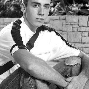
3 from today .... thoughts?

I'm on a crappy computer-monitor at work so I can't give anything useful because I can't view those accurately.

But still I want to comment.... I like your portraits.... :)

And one thing for #1 and #3 I didn't expect to see the light on that side of her. Not necessarily bad choice but I'm interested why you chose to light her from that side?
I like lighting in #2 it goes with her posture and haircut.
 
I like #1 and 3 but to be honest, that partially open mouth thing is not working at all for her IMO. I had to double take because I wondered if she was wearing braces or something.. the angles and the way her mouth is open catches just between her top and bottom teeth in a way that is not the most attractive.
 
I'm on a crappy computer-monitor at work so I can't give anything useful because I can't view those accurately.

But still I want to comment.... I like your portraits.... :)

And one thing for #1 and #3 I didn't expect to see the light on that side of her. Not necessarily bad choice but I'm interested why you chose to light her from that side?
I like lighting in #2 it goes with her posture and haircut.
I lit her from that side because she had a tendency to have the majority of her hair on the opposite side, it was to balance that out

here is one that I took a little extra time with ....

Jodie 4 by Chris Crossley, on Flickr
 
And one thing for #1 and #3 I didn't expect to see the light on that side of her. Not necessarily bad choice but I'm interested why you chose to light her from that side?

I lit her from that side because she had a tendency to have the majority of her hair on the opposite side, it was to balance that out

I knew your answer will be that, because that's the first thought that cross my mind about why did you do it that way. I understand why you did what you did but still kind of do mind that light in those two photos. When I look at those photos the only thing I see is the light, not her.
All I can think of is that she would have naturally a shadow underneath that hair and I would lit her from the other side (her right). Maybe with some suitable edit, texture you can create something like you did with #4 and in that case I wouldn't mind the light.

However, #4 is a great one. You have the same lighting there, but the angle, her expression, your edit, the mood and everything goes together.

I'm not so sure I manage to explain my thoughts and sorry if I don't sound clear enough.
 
well, when you say naturally lit I say likey! :)

nitpick - wanna see her arms, and hair on her right shoulder

I went trough you flickr and really like what you have there. can we "arrange" a session? :)

edit to correct myself
 
Last edited:
I really like #2.
 
I don't get the first one, really. There's a lot of bog-standard TPF criticisms that can be leveled at it, but I will skip those. Mostly it's just kind of blah.

The second one is a straight-up Rembrandt, and as-such she should be a little to the right in the frame from here she it. Love it, though.

Third one.. I can't put my finger on it, but it feels a little off. I think a higher lighting ratio might have pulled it together a bit more for me. In post, I would anyways emphasize the gradient on the background some.

Love the 4th one in reply #5, really well done, also the 4th in #7 (although I think pushing her slightly left in the frame would strengthen this one).
 
Oh, wow! #4

I see angel wings.
 
I don't get the first one, really. There's a lot of bog-standard TPF criticisms that can be leveled at it, but I will skip those. Mostly it's just kind of blah.

The second one is a straight-up Rembrandt, and as-such she should be a little to the right in the frame from here she it. Love it, though.

Third one.. I can't put my finger on it, but it feels a little off. I think a higher lighting ratio might have pulled it together a bit more for me. In post, I would anyways emphasize the gradient on the background some.

Love the 4th one in reply #5, really well done, also the 4th in #7 (although I think pushing her slightly left in the frame would strengthen this one).

OMG...these are my thoughts exactly...
 
I don't get the first one, really. There's a lot of bog-standard TPF criticisms that can be leveled at it, but I will skip those. Mostly it's just kind of blah.

The second one is a straight-up Rembrandt, and as-such she should be a little to the right in the frame from here she it. Love it, though.

Third one.. I can't put my finger on it, but it feels a little off. I think a higher lighting ratio might have pulled it together a bit more for me. In post, I would anyways emphasize the gradient on the background some.

Love the 4th one in reply #5, really well done, also the 4th in #7 (although I think pushing her slightly left in the frame would strengthen this one).

OMG...these are my thoughts exactly...
WOW! I've never seen you agree with anybody!

@binga~ I think these are great. I agree with Bonnie though that the slightly open mouth isn't too flattering to her though. There is also a slight green cast, but perhaps that is my monitor.
 

Create an account or login to comment

You must be a member in order to leave a comment

Create account

Create an account on our community. It's easy!

Log in

Already have an account? Log in here.

Back
Top Bottom