Of the three, #3 does it for me. I like the textures and colors.
Did you change the colors on this one? It almost looks like the bumpers installed on the side of buildings - which are usually black. Regardless, I still like the colors and textures of this one.
#1 - I really like.
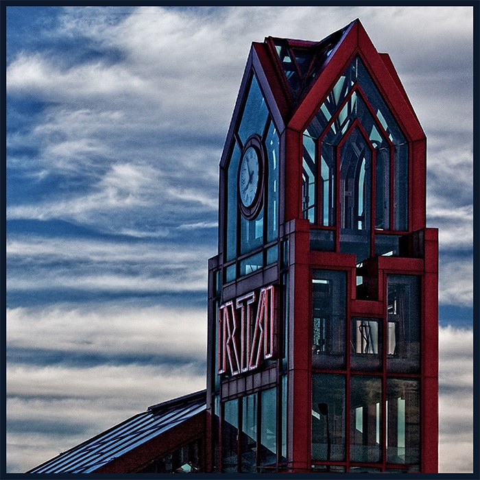
#2 - I like it... but there is something about it thats keeping me on the fence... not sure...
#3 - :meh: This one does not appeal to me.
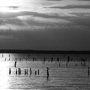
#2: I find myself looking at the sky behind the subject more than the subject itself. Not really so interesting, imo. But not a bad shot either.
#3: Yay for bird shxt. Probably none there but that's what the white reminds me of, I like the textures available in the frame but I feel like I've seen it before? Idk... It's just not for me, I guess.
They are all good but I love the third one. I LOVE textured walls ie. Concrete, old paint peeled walls, etc. They are of great use when using them in photo manipulation....textured overlays and such.
Obviously #1 is the keeper. #2 does seem to be off-kilter a tad. #3 is great for texture if you happen to be a 3D modeler and need something to coat models with. One thing though, why you gotta be so bitter?
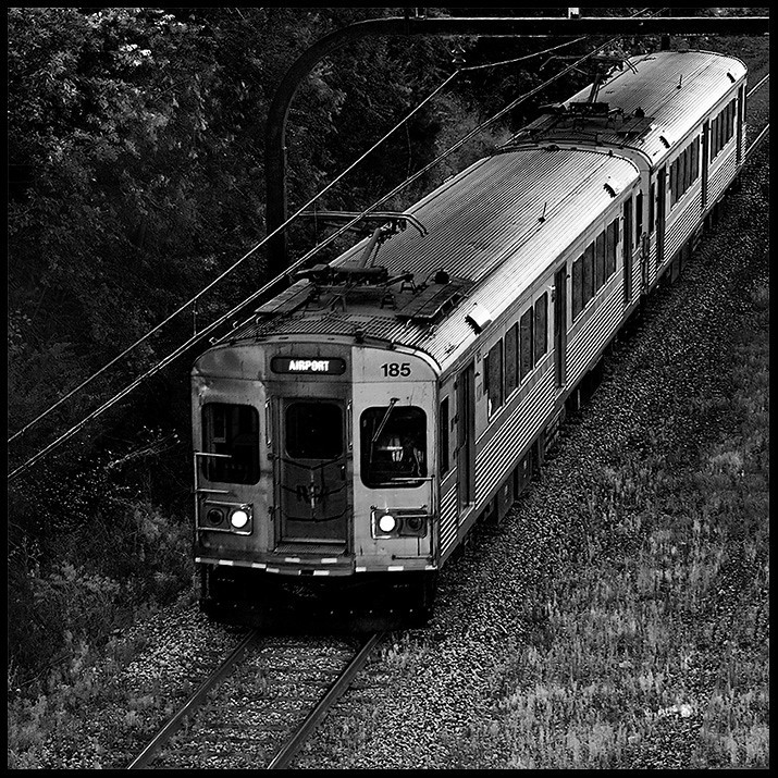
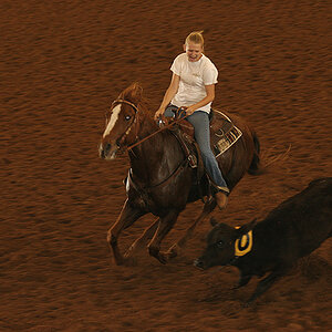
I like #1 and #3, but #2 doesn't do much for me. I like the colors and textures and the abstract nature of the last shot, and I like the train shot just because I like train photos, and the "airport"destination light on the train car adds a bit to the shot.
Did you change the colors on this one? It almost looks like the bumpers installed on the side of buildings - which are usually black. Regardless, I still like the colors and textures of this one.
Nope, that was the sky. I was attracted to the horizontal cloud lines, and the vertical tower lines. Not my favorite, but I like it enough that I wanted to see what others thought.
The Train is my favorite of this bunch. The Rapids (trains) come every 10 minutes, and this was shot through a chain link fence. They were a tough subject.
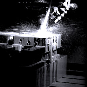
I find #1 dark but I understand the glare off the sheet metal would blow out with a higher exposure. Do you suppose a CPL would help in this situation?

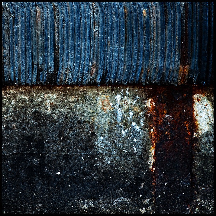
 It's just not for me, I guess.
![[No title]](/data/xfmg/thumbnail/33/33493-f055dbbe7f00f271d3959dd3a6482165.jpg?1619736004)
![[No title]](/data/xfmg/thumbnail/33/33496-cbbeddf3051451b7c3d3db2cd5ed1dc0.jpg?1619736004)