You all are wonderful! Thanks so much for the in depth critiques

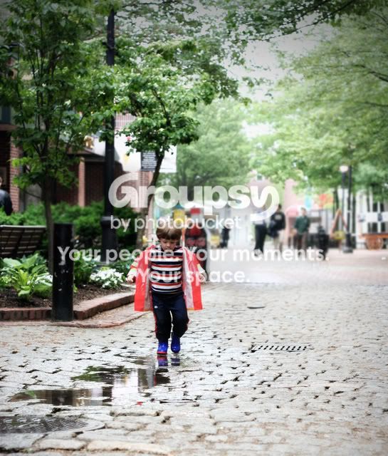
I LOVE the settings in each pic, and the colors of his raincoat against the building in the 1st pic is fantastic!
:thumbup::hugs:
IMO..
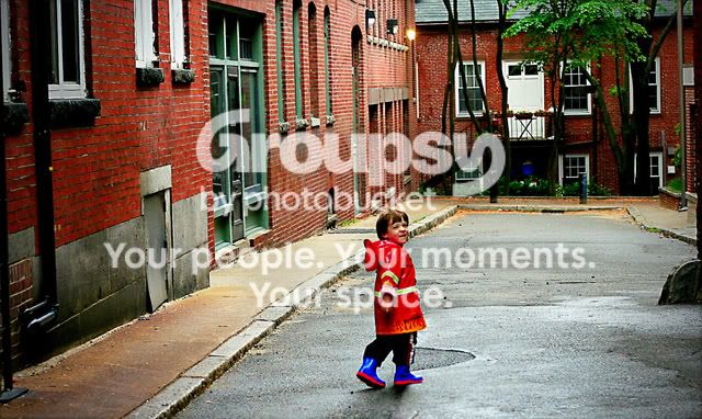
too much saturation on the 2nd one?
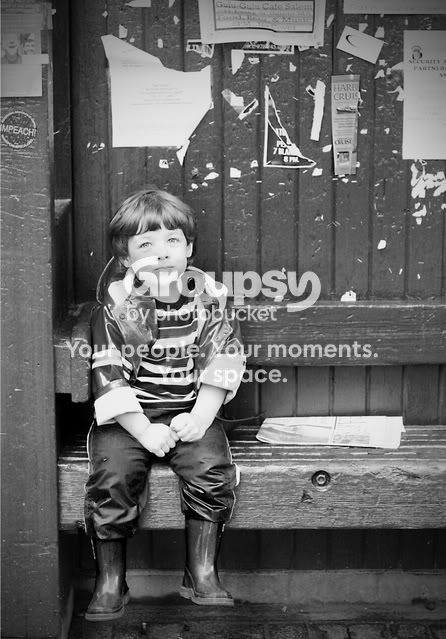
maybe a little more contrast on the first B&W one??
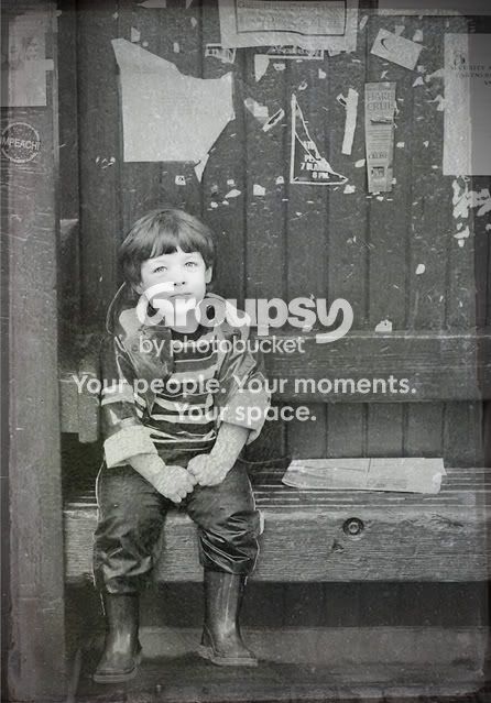
and the texture on his hands is weird.
Ooh I loved the extra saturation on the second one
Loved the contrast one the b&w one too

(but totally appreciate your viewpoint!)
Yes, that texture on the hand IS weird. I think I"m going to toss that version.
:thumbup:
1. Nice capture, but most of the sidewalk should be cropped off. Maybe just a tad (1/2 stop?) over exposed on the highlights of the child.
2. I rather like this one, I think the composition works, but it does seem a little over-saturated and slightly too contrasty. I'd also consider cloing out that dark object on the RH side about 1/3 of the way up. THis might work well as a BW because of the somewhat Dickensian nature of the brick buildings.
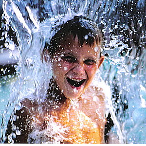
3a. Nice capture, but needs a slight lessening of the highlights (the face, arms and cuffs seem about one stop over to me) and a mild contrast reduction.
3b. I'm afraid I don't much care for this version.
4. Excellent; I'd like to see a slightly tighter crop to showcase the child a little more, but other than that, I really like it.
Just my $00.02 worth - your milage may vary.
Good idea for the crop on the sidewalk! Actually for that shot, the SOOC is underexpoosed, so the overexposure happened during PP. I'll work on it.
I'll try the 2nd in b&w!
I need to fix those hot spots, thanks!
on 4, I'll try different crops, thanks!
Kelly- Do you have some art training? You composition is the pest part of you pictures (except for the child, he really does not seem to mind being a model.
on One- I would have bracketed the shot. Or in the alternative metered the subject and then the background and averaged the two. this would darken the background a little and make it a little less startling, but kept the subject (child) in good exposure.
Two- the scale of this one bothers me. You could crop, but I would use a longer telephoto to foreshorten the background and bring it closer to (what is you r son's name?) the subject. An alternative would be to move him further down the cul de sac.
three is a wee bit over exposed- His face is too lacking is features- other wise a great picture. It would be interesting to see what a red filter would do to this one. On the camera, not in PP. Dump 3b
Four, again a longer telephoto to bring things together. A crop would emphisise him, but the telephoto would bring the back ground closer and make it more intimate. As with two, the perspective or scale bothers me. JMHO
I hope that you don't mind an old man chiming in!
Judge Sahrpe
Hi JS
Ya, I went to college at a private art school for 2 years so I thinkk my tendency is always much less technically inclined, but more artistically inclined.
For 1, I have several shots actually, I'll get to posting those to get an idea from you of which bracket worked the best.
2, Caleb is his name
I was using my prime, wishing I had a zoom at the time

3. I'm going to try to bring back some detail in PP, I think. I'll dump 3b, your right.
4, maybe I can crop for a better comp.
Thanks so much!


 ) so he's really great practice. I would really appreciate any/all critique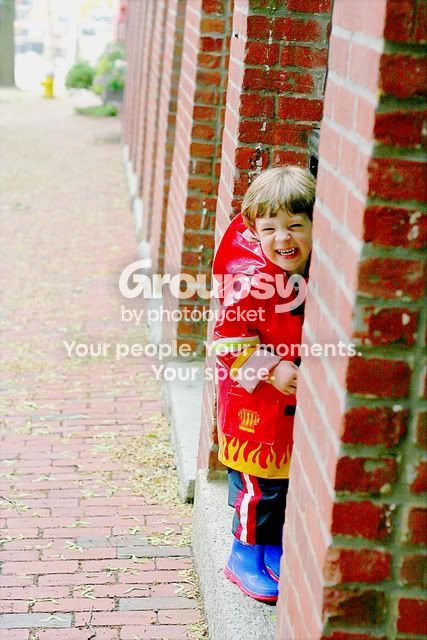


![[No title]](/data/xfmg/thumbnail/32/32805-61ca9a4fb87d37c0ef4f991ac1705e1f.jpg?1734162488)

![[No title]](/data/xfmg/thumbnail/41/41905-b622c7d92c817afea0d4f5704e7fb329.jpg?1734176270)
![[No title]](/data/xfmg/thumbnail/37/37603-739c5d9b541a083a12f2f30e45ca2b7b.jpg?1734170731)