What's new

4 shots for C&C please

hankejp

TPF Noob!
Joined
Aug 24, 2008
Messages
608
Reaction score
0
Location
Wausau, Wisconsin
Can others edit my Photos
Photos OK to edit
Finally went out last week after not being out shooting in a while. Any C&C you can give me would be great. Thank you for looking. ~Joe

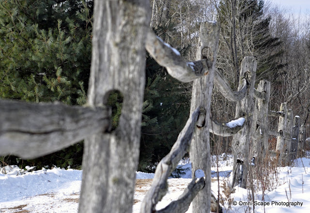
1.)
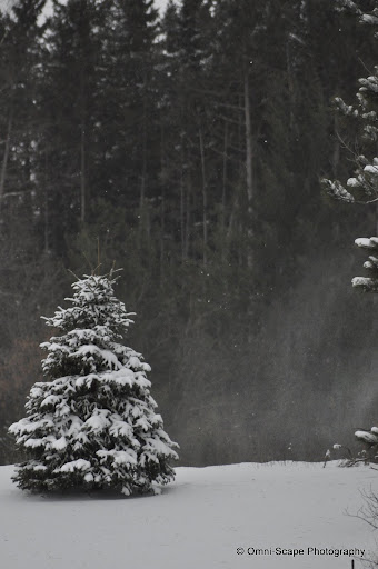
_DSC0221.jpg


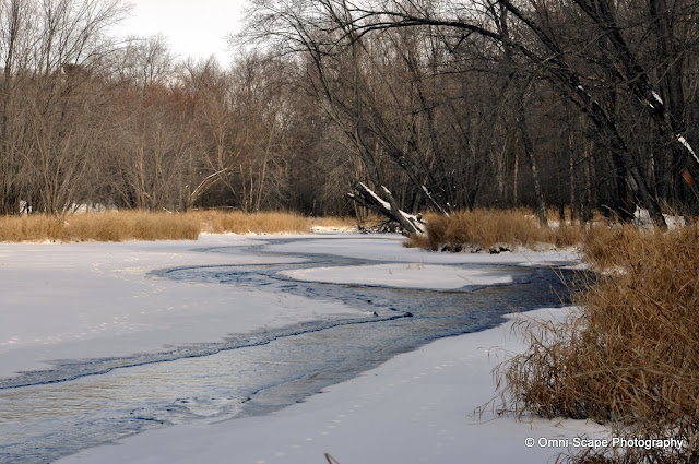
2.)
_DSC0325.jpg


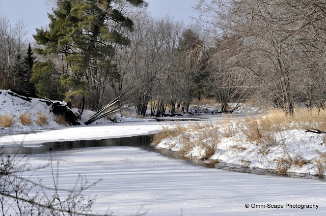
3.)
_DSC0340.jpg


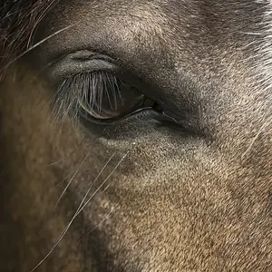
4.)
_DSC0349.jpg

http://lh3.ggpht.com/_ZhwzyT-MfFo/SzDMtLsiorI/AAAAAAAAC54/tK-68sxhmzw/s640/_DSC0340.jpg
 
in general they are all overexposed joe. and the light is flat.
so they could all benefit from some contrast adjustment.

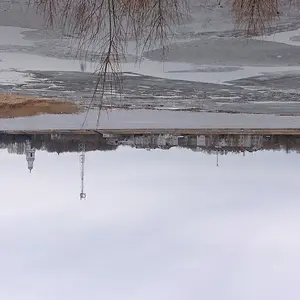
1 your subject (little tree) is a bit too far of to the left and the branches on the right have to go.
i would crop, adjust contrast and saturate a tad.

2 i like the idea of this one and the composition is good.
the fence post in the foreground should be in focus however and there too many little sticks in
the background which distract.

all this is not so important though, what is is that you went out there and took pictures. :thumbup:
 
in general they are all overexposed joe. and the light is flat.
so they could all benefit from some contrast adjustment.

1 your subject (little tree) is a bit too far of to the left and the branches on the right have to go.
i would crop, adjust contrast and saturate a tad.

2 i like the idea of this one and the composition is good.
the fence post in the foreground should be in focus however and there too many little sticks in
the background which distract.

all this is not so important though, what is is that you went out there and took pictures. :thumbup:


Thank you or the reply Wim. I'll have to play with the 1st one. Not too much I can do with the 2nd, besides going to reshoot it. I appreciate the comments.
 
1.I really did not like it much. Nothing interesting and the background is way to dark to me. LIke Wim said the branches on the right side of the frame also not looking good
2.Liked it very much. I loved the idea. It really did not look that overexposed to me but I am not a pro. Maybe there is something I can't see...
3.&4. are pretty much same to me. If I were to pick one of the 2, I would probably pick the 4th.

But to me the winner is the 2nd one. You did add some view to it. The 3rd and the 4th ones are just plain nature. And the 1st one, I better not comment on it:)
 
<snip>
1 your subject (little tree) is a bit too far of to the left and the branches on the right have to go.
i would crop, adjust contrast and saturate a tad.

2 i like the idea of this one and the composition is good.
the fence post in the foreground should be in focus however and there too many little sticks in
the background which distract.
<snip>

Agree with both points, but didn't feel they were over-exposed that much. In the last picture, under-exposing it would have made it a more vibrant photo.
 

Create an account or login to comment

You must be a member in order to leave a comment

Create account

Create an account on our community. It's easy!

Log in

Already have an account? Log in here.

Back
Top Bottom