5 Photos Old Wagons C & C Please

mooimeisie

TPF Noob!
Joined
Feb 17, 2009
Messages
711
Reaction score
12
Location
Edmonton, Alberta, Canada
Can others edit my Photos
Photos OK to edit
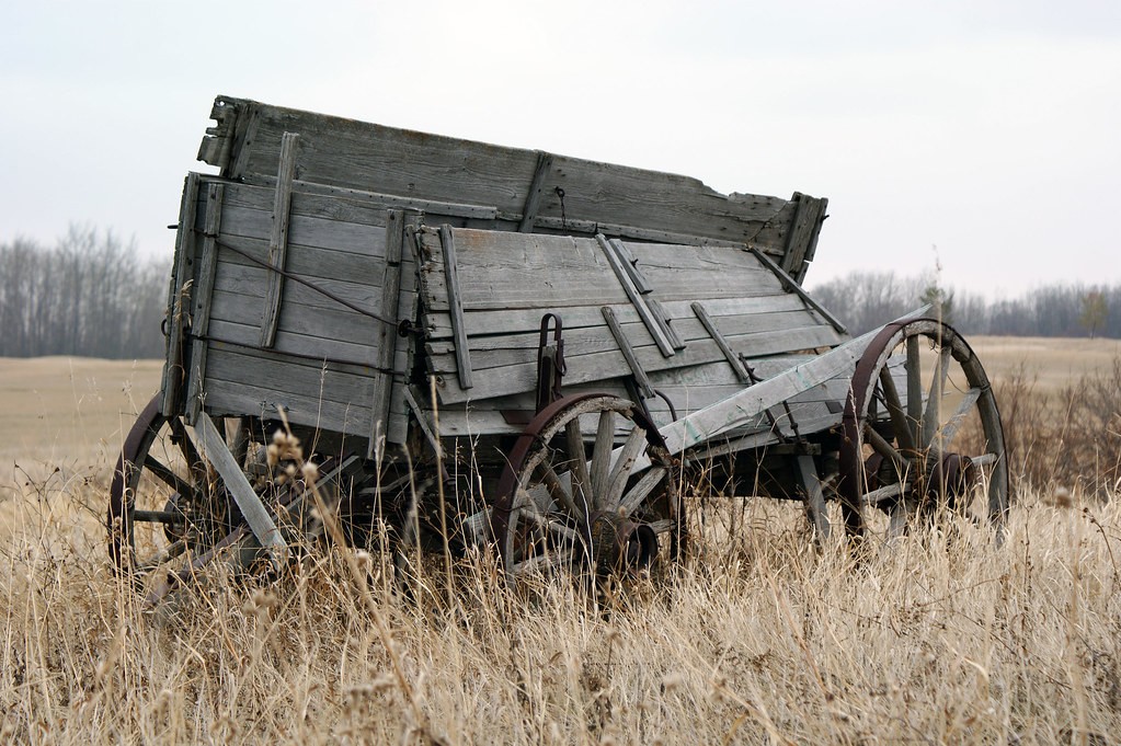
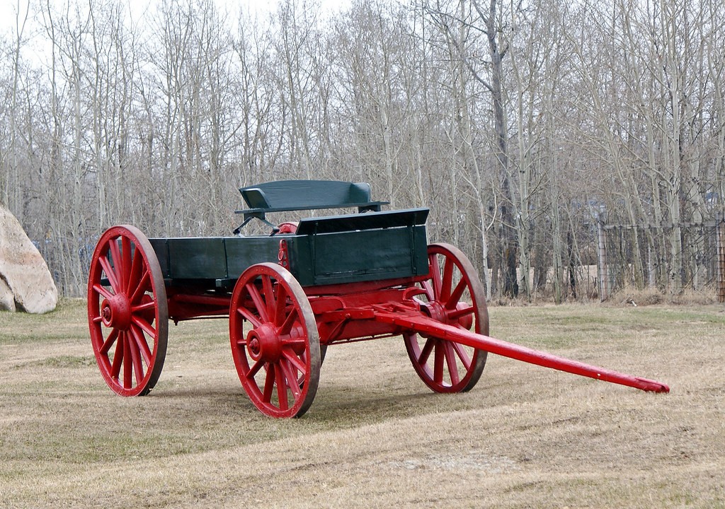
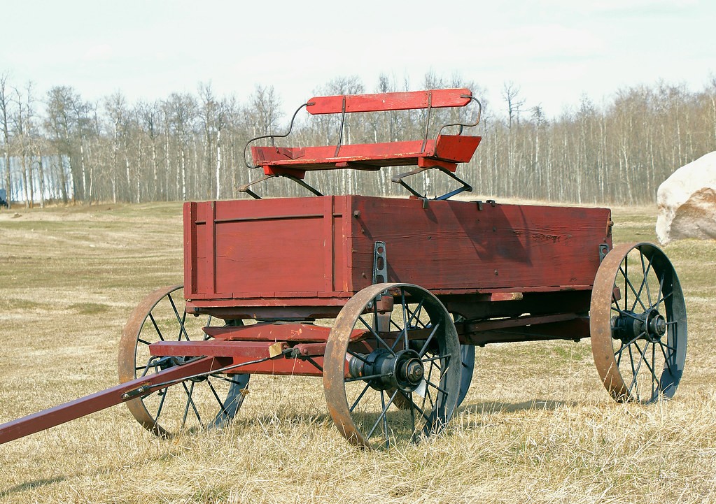
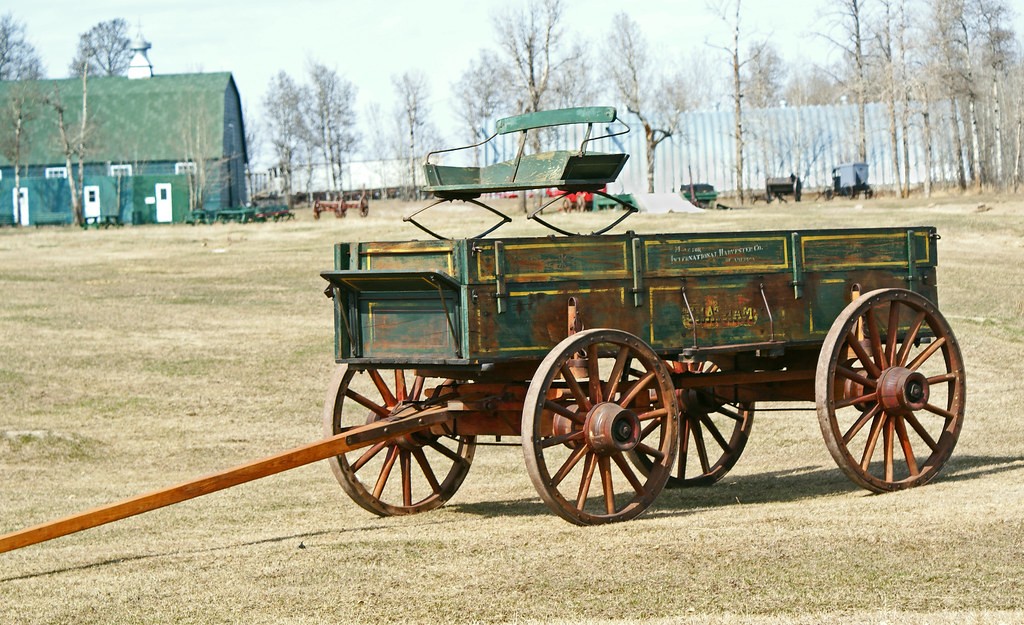
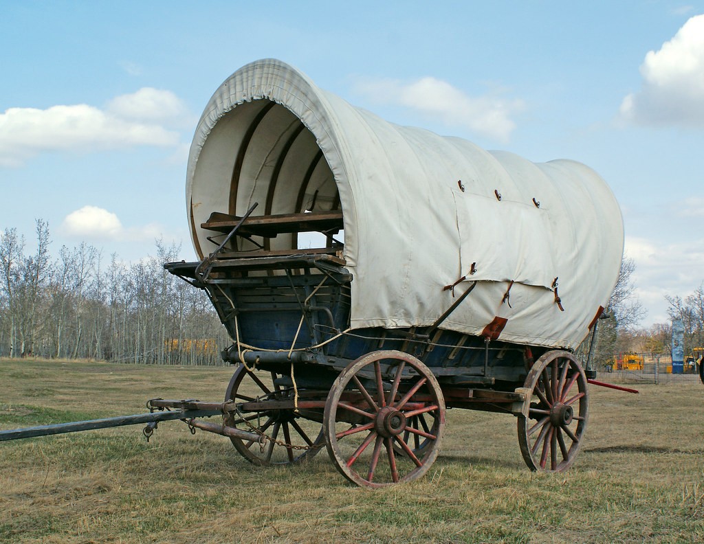
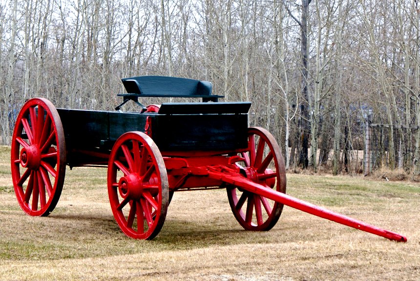
Took a drive around today and took these pictures of old wagons. #1 and #2 were taken in the morning when it was cloudy and the rest were taken after the sun came out. All were taken with a Sony 18-70 lens. C & C is very welcome as I found it a very useful way to learn. Thanks for looking.


3474632226_23a99e5958_b.jpg


3473828555_8092a7b362_b.jpg


3473826897_31f2140b4a_b.jpg


3474637880_fb6ae23ba0_b.jpg


3473832227_4db669e207_b.jpg
 
I like #1 the best because of the background. On the others, the background is distracting. Shots like these are hard in that there seems to always be someting behind what you want to shoot. Stoping down the aperture will get you a shallower depth of field and can help 'mask' the background by blurring it. #2 looks tilted. The ground could be on a slope, but the tree is tilted too. Even if the tree is tilted, sometimes it's good to level a photo out so the tree, in this case, looks vertical. I feel a lot of folks oversaturate these days but bumping things up slightly might bring more feeling into the shots in this case.

HTH
 
I agree that #1 is your best shot although it could use a bit of contrast perhaps..

#2 could have been good if it was more level and better composed. The rest are just interesting snapshots..

Here is a different look at your #2

3473828555_8092a7b362_b.jpg
 
I like the last shot the best in part, because there is color in the sky. The others seem a bit dull.

You might try some graduated filters. ? Good subjects to shoot.

JMO

dan
 
Thank you both so much for your input. LarryD, I really like what you did to #2. Oh, so much to learn. Thank you again.
 
I did a little editing on Flickr with #2. I think it came out a little more as suggested. The sky is a nicer color in the last photo, because the sun finally came out.

3474359153_6b8d3ef182_o.jpg
 
i really like the first picture as well as the last one. only complaint on the last pictures is that it is cut off on the left. not sure what it was connected to though ( if anything) so maybe you purpously did that


cool shots
 
i really like the first picture as well as the last one. only complaint on the last pictures is that it is cut off on the left. not sure what it was connected to though ( if anything) so maybe you purpously did that


cool shots

I see what you mean. I really can't remember why I cut it off, but looking through all the photos I took, I did the same thing. Thank you.
 
I did a little editing on Flickr with #2. I think it came out a little more as suggested. The sky is a nicer color in the last photo, because the sun finally came out.

3474359153_6b8d3ef182_o.jpg
Good effort, mooimeisie. The hard part here is to not oversaturate colors. The balance is to bring them out some for, as they say, more "pop," without making it look too much like 'pop art.' Look at photos with grass in them and you notice how many folks over staturate and make grass look almost neon. That's great if that's what your after, but it doesn't have a natural look. I assume you're going for a natural look here.

The other (or should I say 'another') hard thing is to retain details in the shadows. Your original above has lots of nice shadow detail. Again, the balance is to keep the detail but bring out some contrast to show it off even better. Look at LarryD's example and you'll notice contrast is higher but there is still detail in the shadows.

And, since the wagon is now level, it has an overall better feel to it.

Editing is hard and can be frustrating. You might have 1/2 dozen variations on your monitor and it can be, and usually is, hard to pick which edit you like best.

Keep editing! You're on a good track :)
 

Most reactions

New Topics

Back
Top