C CouncilmanDoug No longer a newbie, moving up! Joined Feb 5, 2012 Messages 335 Reaction score 55 Location Fl Can others edit my Photos Photos OK to edit Jun 23, 2012 #1
imnikola TPF Noob! Joined Jun 24, 2012 Messages 2 Reaction score 0 Location Serbia Can others edit my Photos Photos NOT OK to edit Jun 24, 2012 #2 Sbc members being on here how nice
C CouncilmanDoug No longer a newbie, moving up! Joined Feb 5, 2012 Messages 335 Reaction score 55 Location Fl Can others edit my Photos Photos OK to edit Jun 25, 2012 Thread Starter 🔹 #3 lolz. any critique from anybody?
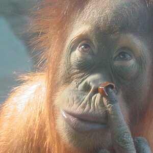
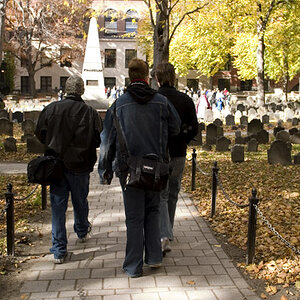
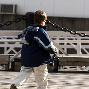
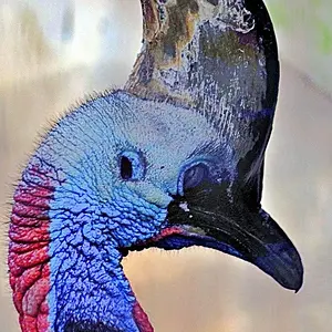
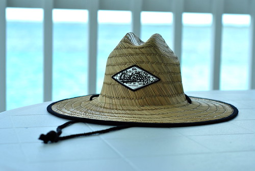
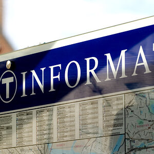
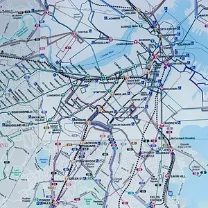
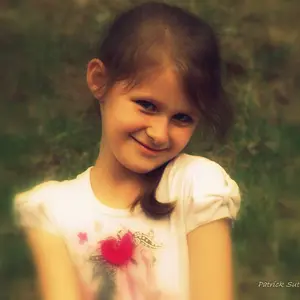
digital flower No longer a newbie, moving up! Joined Oct 18, 2005 Messages 1,409 Reaction score 36 Location CT Jun 25, 2012 #4 CouncilmanDoug said: lolz. any critique from anybody? Click to expand... I take a shot at it. #1 I like it but the background almost seems too blurred. Colors are great #2 looks a little noisy and I don't like the pink lights coming in on the top #3 Nice shot. No offense but it would be better with her shirt off. The tilting fence looks a little funny perhaps a little rotation. #4 doesn't do anything for me.
CouncilmanDoug said: lolz. any critique from anybody? Click to expand... I take a shot at it. #1 I like it but the background almost seems too blurred. Colors are great #2 looks a little noisy and I don't like the pink lights coming in on the top #3 Nice shot. No offense but it would be better with her shirt off. The tilting fence looks a little funny perhaps a little rotation. #4 doesn't do anything for me.
fjrabon Been spending a lot of time on here! Joined Nov 3, 2011 Messages 3,644 Reaction score 757 Location Atlanta, GA, USA Can others edit my Photos Photos OK to edit Jun 25, 2012 #5 1) Like it mostly, but I wish her arm had just a bit of separation from the right side of the photo. 2) meh, not my thing. 3) Like it, but would have maybe brightened it a touch. Also would have given her just a little more room above her head 4) It's a hat and the white balance is way too cool.
1) Like it mostly, but I wish her arm had just a bit of separation from the right side of the photo. 2) meh, not my thing. 3) Like it, but would have maybe brightened it a touch. Also would have given her just a little more room above her head 4) It's a hat and the white balance is way too cool.



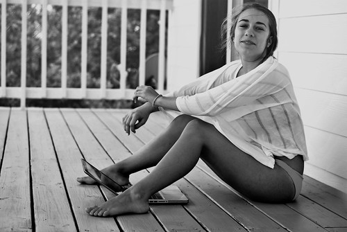


 The tilting fence looks a little funny perhaps a little rotation.


![[No title]](/data/xfmg/thumbnail/41/41762-58f644e561db7433f4f566037a965217.jpg?1734176068)
![[No title]](/data/xfmg/thumbnail/37/37603-739c5d9b541a083a12f2f30e45ca2b7b.jpg?1734170731)