What's new

A couple from Gettysburg

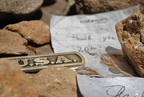
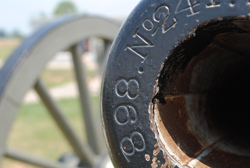
I like the 1st and last shot. The first shot doesn't really "say" anything to me, however, I do like the color layout. The paper seems awefully blurry around the edges though (2 sheets of paper?) and I find that to be distracting. The last shot I like, probably because I have a special place in my heart for firearms and things that go "bang". I like the composition here - being able to see partway down the canon barrel is a nice touch and the carriage wheel being in the shot even though out of focus easily identifies the subject yet allows your eye to wonder down the barrel (focused portion of the shot). There is always something eerie about looking down the business end of a firearm (of any stature).

Cheers!
- Daniel
 
I like #1; the "USA" in focus and "thank you" in the background is pretty cool.

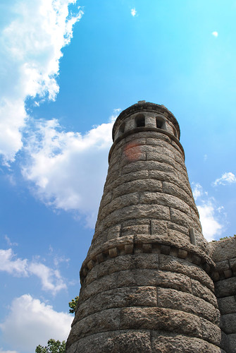
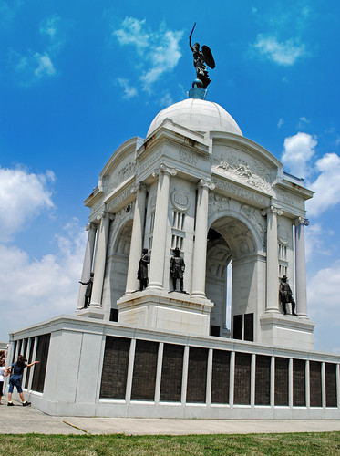
2 & 3 seem to both be leaning to the right, maybe try to straighten them up a bit. Also, the 2nd has a glare sport or something in the center that is a bit distracting. Beautiful sky colors in both! :)
 
Thanks for the replies.
 
1 & 4 are my absolute favorites.

1: Love this idea!
2: Weird bright spot...
3: Leaning to the right, but easily fixed.
4: I'm particularly fond of canons, really like the focus.
 

Create an account or login to comment

You must be a member in order to leave a comment

Create account

Create an account on our community. It's easy!

Log in

Already have an account? Log in here.

New Topics

Back
Top Bottom