Whoa... too many. Try to keep it to 5 ish per thread in the future.
1. ok technically, I think, but not too interesting.
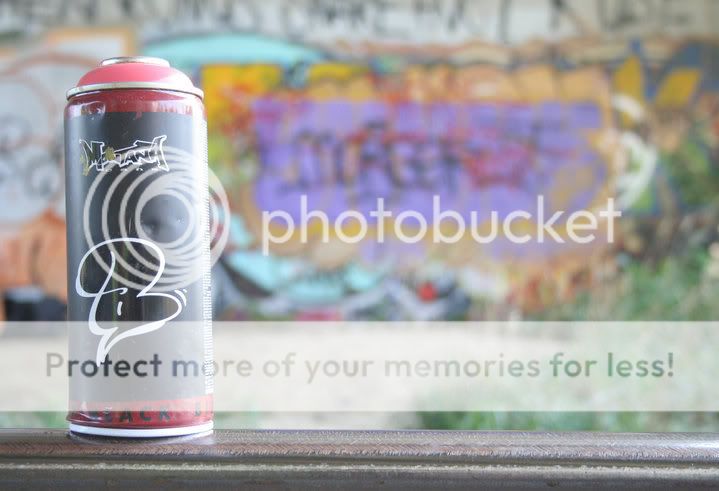
2. seems overexposed, and the can seems a little too close to the side of the frame. Then I find myself wanting to see what the graffiti actually is, not just the out of focus shapes. If the can was not so much to the side I might not be as interested in the background.
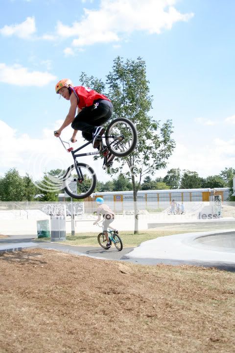
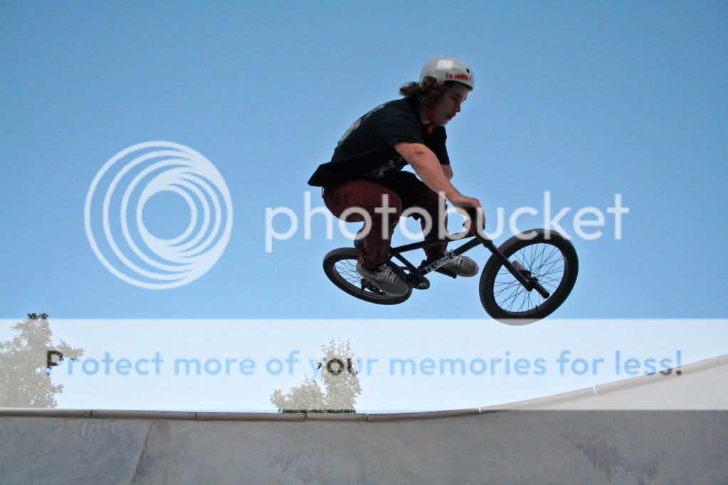
3. the background is too cluttered, the horizon is a little tilted, plus that tree in the middle really takes the focus off of the main jumper. Maybe if you had exposed for the sky and then used a flash to fill in the jumper? I'm not sure, ask someone here. There are a few who have posted good bike jumping pictures.
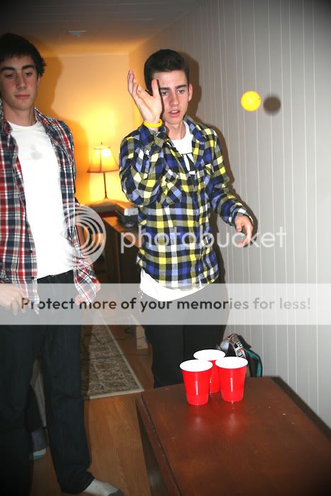
4. Did you used the on camera flash here? It can make some ugly shadows, which seems to be the case in your pic. The kid on the left is underexposed, and he is cut out of the frame on his left side. One of his feet and part of the other is gone too. He has something nasty on his shirt, but since he's watching beer pong... The kid with the ball, his hand is in front of his face and he has red eyes. Again, the background is cluttered.
5. This would be ok if you got rid of the trees and used a flash to fill in the jumper. Better composition than any of your others so far.
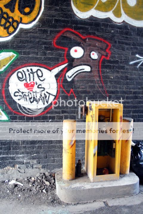
6. Interesting graffiti, but it might have been better straight on because the way the bricks are now is distracting. Though I'm not sure whats up with that yellow thing in front, it doesnt work and distracts from the graffiti, if that was your main subject.
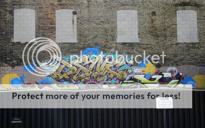
7. Better, but maybe lacks a little contrast and the graffiti could use just a tiny bit more color to make it stand out more. The black thing in front is no good though. I keep trying to read the little words on the sign and can't, and then I wonder what that thing on the left is. Without it, however, the window things on top would be unbalanced, but they dont really add anything in my opinion to begin with.
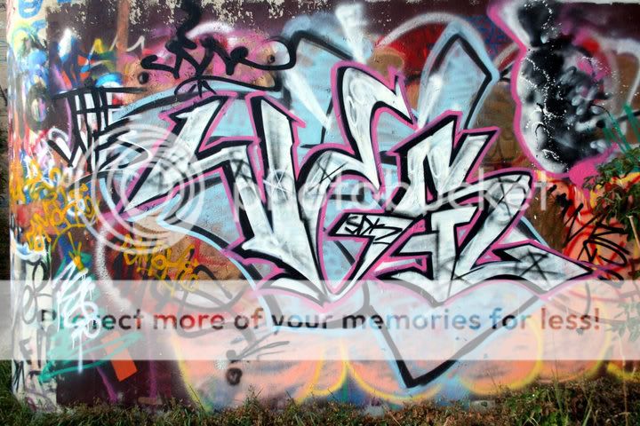
8. The last one is interesting, and probably the best. It seems well exposed and the colors stand out but dont poke you in the eye, so thats good. Maybe crop a little off the right side, to get rid of that bush, and a little off the bottom, to get rid of the grass, and a very little off the left side to get rid of the line or whatever it is.
Thanks a lot for the critique! Sorry for having so many pictures up by the way. I already tried some of the small things you suggested and they are helping greatly. Thanks a bunch!!