LINYBIMMER
TPF Noob!
- Joined
- Dec 17, 2008
- Messages
- 118
- Reaction score
- 16
- Location
- New Yawk
- Can others edit my Photos
- Photos OK to edit
Would love to hear your C&C:
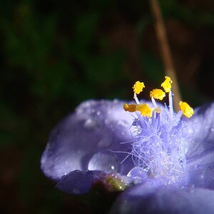
1 DSC02617 by jimkerr1961, on Flickr
2
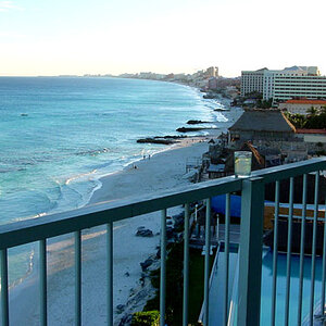
DSC02610 by jimkerr1961, on Flickr
3
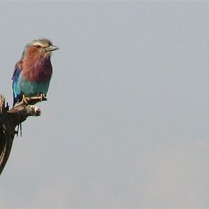
DSC02593 by jimkerr1961, on Flickr
Thanks for looking
1
DSC02617 by jimkerr1961, on Flickr2
DSC02610 by jimkerr1961, on Flickr
3
DSC02593 by jimkerr1961, on Flickr
Thanks for looking
")


![[No title]](/data/xfmg/thumbnail/40/40310-01bec1b9b7918522bf21a09cf75c5266.jpg?1619739414)


![[No title]](/data/xfmg/thumbnail/35/35264-5ade32b7036391926536661aeb7491c3.jpg?1619736969)