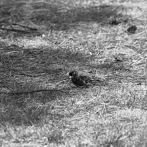
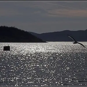
These are really, really good! My only suggestion would be to bump up the exposure in some of the heavier shadows, just to even it out some more.
Also, I like this "logo" much better than what I've seen on some of your photos. It's clean and simple, and definitely clear (I don't know how long you have been using this one, but I am referring to the "large" Copperplate font logotype.)








![[No title]](/data/xfmg/thumbnail/30/30866-bdfc426e8ee7e6ad63f6d751c5f288f0.jpg?1734158835)