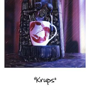
I really like the picture. Something pulls my eye right trough the picture, even into the OOF area, which is odd. Not sure what is pulling me there... maybe the leading lines of the C clap. I am not a big fan of tilt, but I think in this case, it works. If I tilt my head to the right, thie image is just not the same. I also thing the B&W processing lends a lot to the image.
:thumbup:
I really like the picture. Something pulls my eye right trough the picture, even into the OOF area, which is odd. Not sure what is pulling me there... maybe the leading lines of the C clap. :thumbup:
I do like the composition. I'm not quite so keen on the DoF, though, since three things draw the eye to the unfocused area
- the leading lines
- the tilt
- the fact that the brightest thing in the image is there.
Would be interesting to see that OOF tool made the subject with a bit more space above it.
As noted, the eyes go front to back, into the out of focus area. The stuff in the foreground isn't very eye catching, but has some great supporting textures and lines. It's a little incongruous to have the "visual center" or whatever be in the out of focus area, but I am darned if I can see what's wrong with that. The focus isn't about drawing attention here, but about revealing texture where it matters. The stuff in the background is smoother shapes, so we don't need the focus there like we do with the rasp(?).
It's a little hard to look at, simply because we're used to looking in the in-focus material for the "thing we're supposed to look at", but that's not the picture's fault.
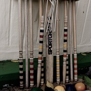
You're right. I was aiming do give a visual of the various objects and to show some distance. With cluttered tables like this the eye can only focus on one area at a time.


![[No title]](/data/xfmg/thumbnail/32/32158-8de1a90710a58144b47a0cee83a6c820.jpg?1619735234)
![[No title]](/data/xfmg/thumbnail/35/35952-55c8d42ec1c6ff0e13b45356cbf9c068.jpg?1619737263)