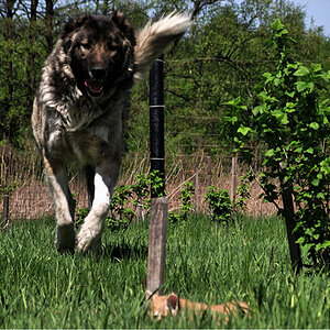
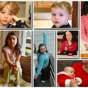
They're mostly pretty dull. Partly it's the subjects and compositions, just not very interesting -- we don't know these people or this dog, and they're not doing much interesting to us, and you haven't done anything to MAKE them interesting, you just shoved them in the center of a rectangle. If you look at them carefully they're graphically dull as well, not much bright colors, bright tones, dark shadows, that kind of thing.
The guy cooking the corn is kind of awesome, though. He's doing something interesting and a little mysterious to us. The fact that your dumped him more or less in the middle of the frame matters less, because he's doing something interesting, AND there's visual drama there with the bright flame, the bright corn, the dark shadows and charred corn husks and so on. The later one you posted with the silhouette and the sparks flying is another good idea. I don't think either one is great, but you've got more elements working for you in those than you do in the other photos.



 !
!


![[No title]](/data/xfmg/thumbnail/33/33422-d1097b04586502aba932c8d5409d8026.jpg?1734163437)
![[No title]](/data/xfmg/thumbnail/35/35877-b537a0bce18fcb18b610d787610f3d3d.jpg?1734167621)