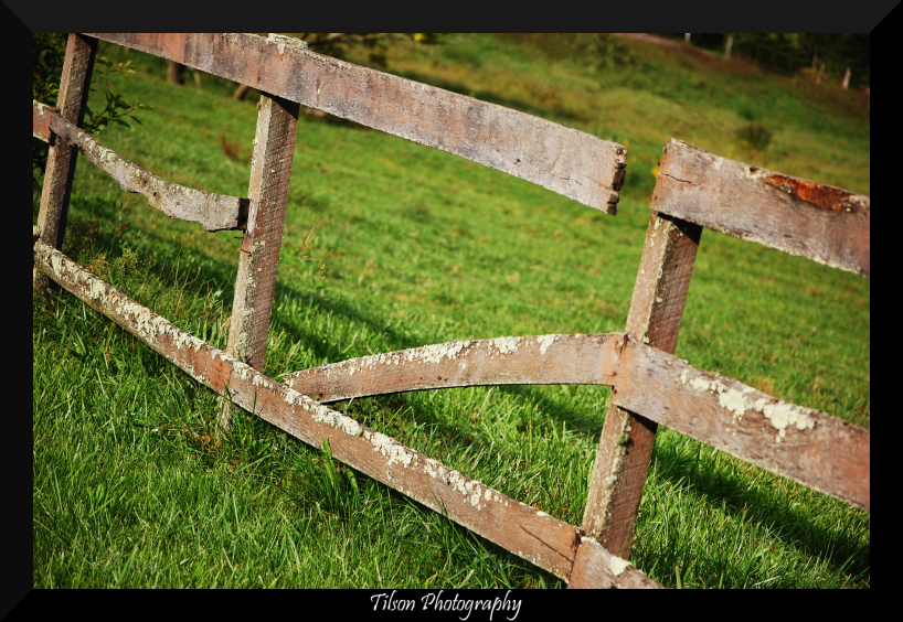
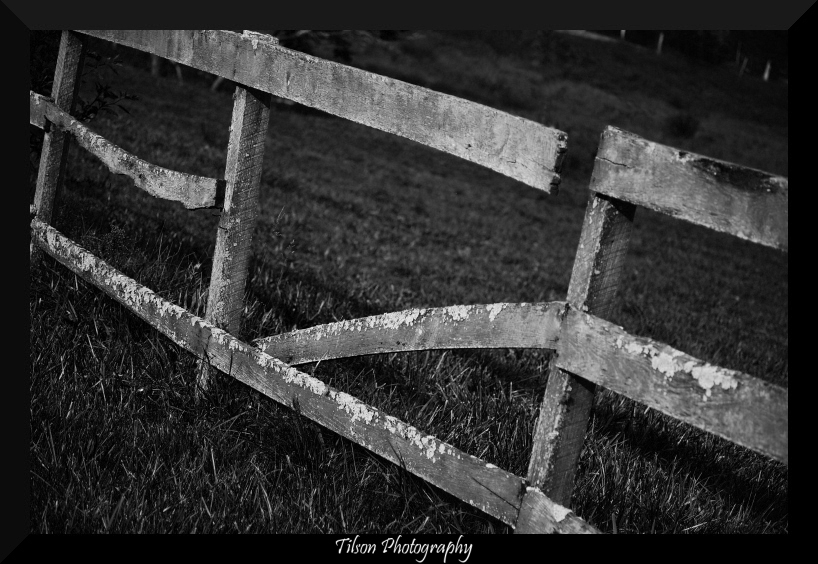
It looks good, but I feel it's too tilted. I agree, a tilt would be fine, but not a large tilt, or just move your position. There is no tilt, the darkness in the two corners are created due to the shade from the trees and the bush. I would reduce the width of the border, you don't want to overdue it. What was the f/stop? I can't find the exif data on the image. I wouldn't go so far as to use f/22 though.... you'd need a tripod. F/12 is good enough for what your looking for.
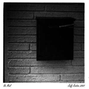
I'm a sucker for b&w, my main shooting is done with film so i prefer b&w in scenery and pattern photos. I assume you are using PS, am I correct? If so, open curves from the cookie image in the layers area, not from image (they do different things). Bring more white into the image just so you can get rid of some blacks, they overpower in the background and then you can bump the contrast to add more texture.
Hope this helps!







![[No title]](/data/xfmg/thumbnail/34/34058-276eb00b31d5bfacf4028e7f729dc601.jpg?1734164474)
![[No title]](/data/xfmg/thumbnail/34/34057-a5a92fad5f5d96a5945d55a404b0cd27.jpg?1734164473)