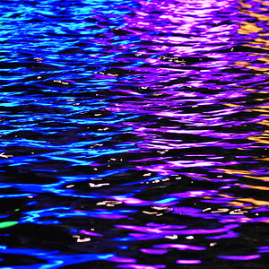
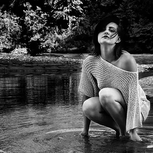
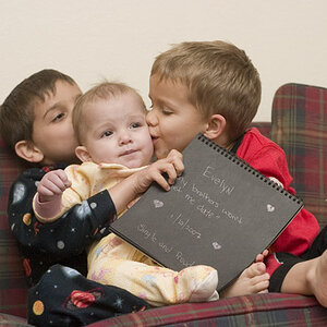
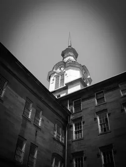
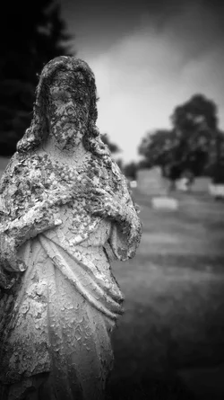
Yeah, so you're aware of the vignette, so I won't go on about that. They work better if they're subtle and don't attract so much attention.
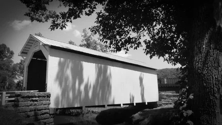
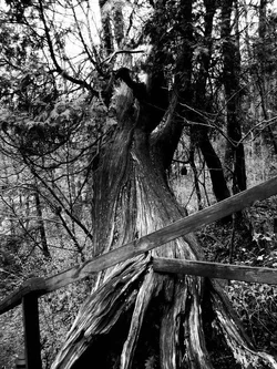
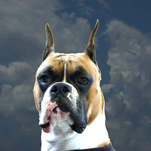
The upper left and lower right (numbers please!) are more promising than the others, and it looks like there are some interesting images in there, but both include too much in the frame. They're not bad images, but just don't really draw the viewer in. You need to decide what you're trying to show someone in terms of composition and frame the image accordingly. For example, the fence and fallen tree in the last one are interesting but the branches and sky at the top don't add anything and I feel like I should be seeing more of the fence and the bottom of the tree, so perhaps a horizontal shot taken from a lower position and maybe a little closer would have been better. It's always difficult to say without knowing what's just outside the frame, but that's the best I can do.





![[No title]](/data/xfmg/thumbnail/32/32930-09414fc020c2a60a456ff59a05c5ef8f.jpg?1734162706)

![[No title]](/data/xfmg/thumbnail/38/38443-d3f00036791c5f915b132320c9ac8865.jpg?1734172307)