A few for C&C

er111a

TPF Noob!
Joined
Jan 30, 2008
Messages
1,896
Reaction score
6
Location
Virginia
Website
er111a.blogspot.com
Can others edit my Photos
Photos OK to edit
you don't have to cc them all.
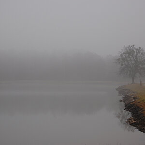
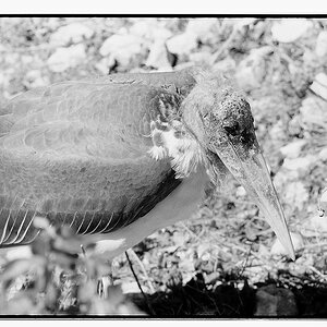
1)
basket.jpg

2)
006-2.jpg

3)
054.jpg

4)
057-3.jpg

5)
052-1.jpg

6)
003-1.jpg

BONUS!! these are two pieces I did, you can cc these if you want to
7)
020-1.jpg

8)
022.jpg

oh and check out my new avatar :)
 
Last edited:
I like the splatters you got on your painting, very clean actually. Both of them are pretty nice.

As far as this set of photos, I'd say they're mostly snap shots again :| most of them are out of focus, and ignoring the PP just not that interesting. You aren't really designating a subject or point of interest, you have things that are the focal point but they just don't finish up the image or tell a story in anyway.

I think what is really holding you back is that you just need to stop, think, and really examine the area. Look around and study what is going on, learn to look for lighting and interesting spots that could help you out with lighting. Compose slowly, even if the subject is moving if you compose quickly and miss the shot it still isn't a shot worth keeping.

Most of what you shoot is still, though, so you can take your time and really check the composition as well as focus.
 
I think #1 is a nice shot. I like the PP. Nice line and form. Simple, effective. If I *had* to nit pick, I wish the ball was just a couple inches more away from the wall.

I can get behind #6 as well, just wish it was pulled out a hair more.

Why did you not bother to straighten #5, I mean, you love photoshop, and there are tools for that.
 
what did you say about #6? lol and I didn't because I think it looks better that away, did you notice there are 3 of me :p lol oh and I learned my tripod is crooked :(. and no thoughts on my two pieces of art :p
 
oh and I learned my tripod is crooked :(.

don't blame your equipment. a crooked tripod is an easy fix. or you could fix it in photoshop.

honestly those paintings you posted are the best things you ever posted here.

first shot is the only good one imo
 
oh and I learned my tripod is crooked :(.

don't blame your equipment. a crooked tripod is an easy fix. or you could fix it in photoshop.

honestly those paintings you posted are the best things you ever posted here.

first shot is the only good one imo
haha I wasnt blaming it I was just saying. thanks I think lol I never really considered myself a painter truth be told, and I like the first one as well
 
I'm new to photography but these are all just my opinions:

#1: I like it. Although the background is confusing for me. Maybe if it was on a basketball court or something, it'd be more fitting. That's just me
#2: It's a little crooked (tilted to the right a touch). And it doesn't look centered. Just little things that throw it off for me on pictures like that. I don't get what I'm looking at either lol.
#3: If you were trying to focus on the flower, focus more :D. It's still a little blurry.
#4: I personally don't like the multi-color thing going on. The house is crooked, the subject (if it's that little machine) is out of focus.. I'm not sure what to make of it.
#5: Again, blurry. Don't know what's going on.
#6: Too dark IMO. I don't like the coloring (how you left some stuff b/w and some stuff color). Is that contrast or something? Looks too..."rich"?
 
what did you say about #6? lol and I didn't because I think it looks better that away, did you notice there are 3 of me :p lol oh and I learned my tripod is crooked :(. and no thoughts on my two pieces of art :p
You gave me an excuse. You didn't answer my question.
Why didn't you straighten it in photoshop? You love PP and that is part of PP.

#6, I think it's a little tight. I just think with a little more of the scene, it might be that much better.

As for the bonus garbage...
 
I like the basket ball one.

I don't see what others see about the painting.... lol the paintings themselves look like something my preK did in school last week.
 
1. I like this the best of the bunch but would have preferred the ball to be further away and a lower angle of view.

2. Not liking or disliking this one. Just "meh" feeling. The three rings remind me of John Bonham though, so points for that.

3. This could have been the best of the bunch had it been in focus. Good composition and decent colors.

4. This does nothing for me. At all. It's as if the camera was hanging around your neck and you accidentally hit the shutter button. It wasn't one of those happy accidents either.

5. This one looks like bad security cam footage in color. The place has some potential for a decent shot. This wasn't it. I'd go back there and experiment. Start with a level tripod. That lighting could lead to something cool and dramatic.

6. Lower the camera and move to the right. And level. Look down the aisle and show some of the floor. The lines in this don't lead anywhere, they just act like speed bumps for your eyes.

7. This would appeal to me more if there were more randomness in the positioning of the circles. It looks too formulaic, with two vertical rows and then some filler.

8. Same thing as 7, except three rows.
 

Most reactions

Back
Top