A few from Detroit

Puscas

TPF Noob!
Joined
Oct 7, 2006
Messages
1,884
Reaction score
3
Location
Brooklyn NY
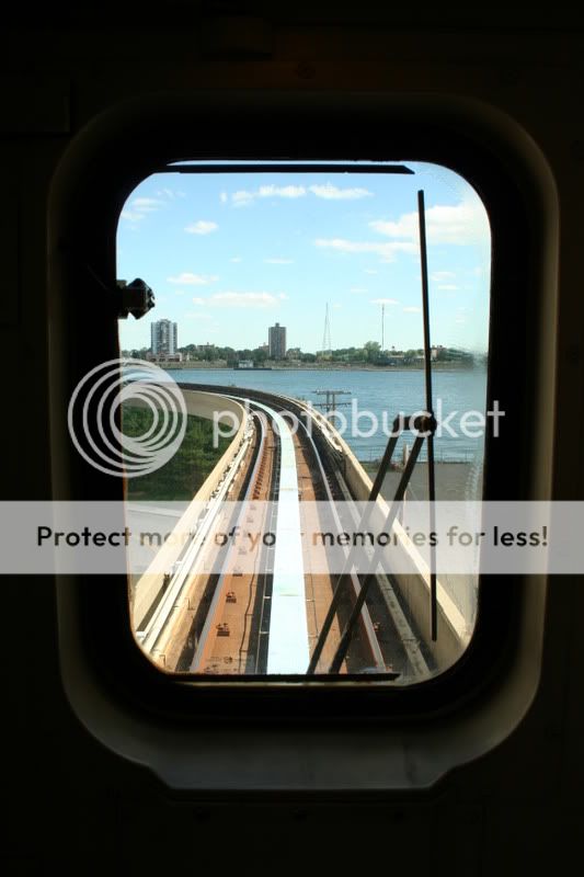
It's my first visit to Detroit, so there are probably a few in here that every visitor makes, but hey I still had fun taking the pics. C&C, as always, welcome.

1.
detroit009.jpg


2.
detroit011.jpg


3.
detroit001.jpg


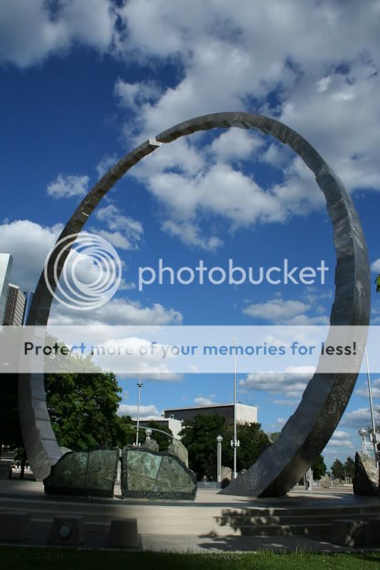
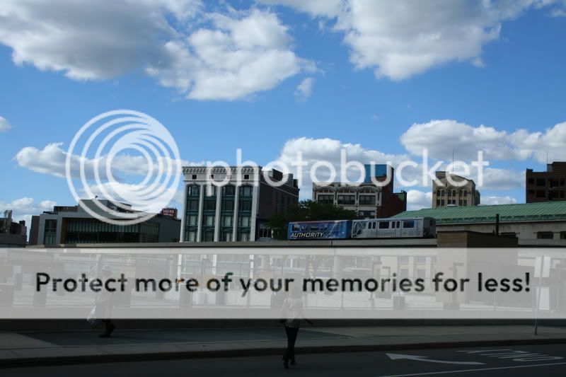
And the last one: does anybody else think that this looks like one of those drawings developers make to show what the future city will look like? (even the people look 'staged')
4.
detroit.jpg


thanks for looking!


pascal
 
Yeah I totally agree with you about the last one!

The people look sterotypical...

I like the first; it's too bad that those shadows got in the way.

The second is pretty cool too, but the words are distracting, and I think it would look better if it was more symmetrical.
 
nice shootout, however, I somewhat felt that the photographs lack subjects...

for the first one, there could have been a couple or someone else sitting near the monument. it would have presented a contrast between heights then.

you should have got the full writing in the frame for the second...

ok for the third...

details are lost in the foreground for the fourth. must make shadow & highlight corrections in photoshop.

good pictures overall :)
 
Yeah I totally agree with you about the last one!

The people look sterotypical...

I like the first; it's too bad that those shadows got in the way.

The second is pretty cool too, but the words are distracting, and I think it would look better if it was more symmetrical.

You know, I really thought it was pretty symmetrical, but it's not. You're right. As for the words...yes I can totally see how that's distracting. Have to do better next time. Thanx!

nice shootout, however, I somewhat felt that the photographs lack subjects...

for the first one, there could have been a couple or someone else sitting near the monument. it would have presented a contrast between heights then.

you should have got the full writing in the frame for the second...

ok for the third...

details are lost in the foreground for the fourth. must make shadow & highlight corrections in photoshop.

good pictures overall :)

I'm not quite sure about the people in the first. I actually waited for a people free shot. You think the statue lost its grandeur? That's something to think about.

As for the writing: yeah, that's not good.
And for the fourth, I had the same idea but somehow it lost its 'developer image' appeal when I tried to brighten it. But maybe I'll give it another try.
And what is lacking subject-wise? I was going for: statue, ornament, view and cityscape.

Thanx for looking and the comments. Really appreciate it!!


pascal
 

Most reactions

Back
Top