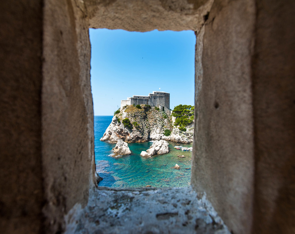
The first has the most potential, but I'll tell you what's bothering me about it. First, there's too much of the window - if you cropped most of it out we would still know it's a window and it would still frame the scene within - and it's not dark enough IMO. OOF foreground framing is best darkened so the blur doesn't hit you over the head as much - not always, but I think that's the case here. The other issue is that the small piece of rock and in the lower left of the water is distracting. Moving down and a little to the left would have eliminated that. If you agree about all this, you could do some cropping and cloning.
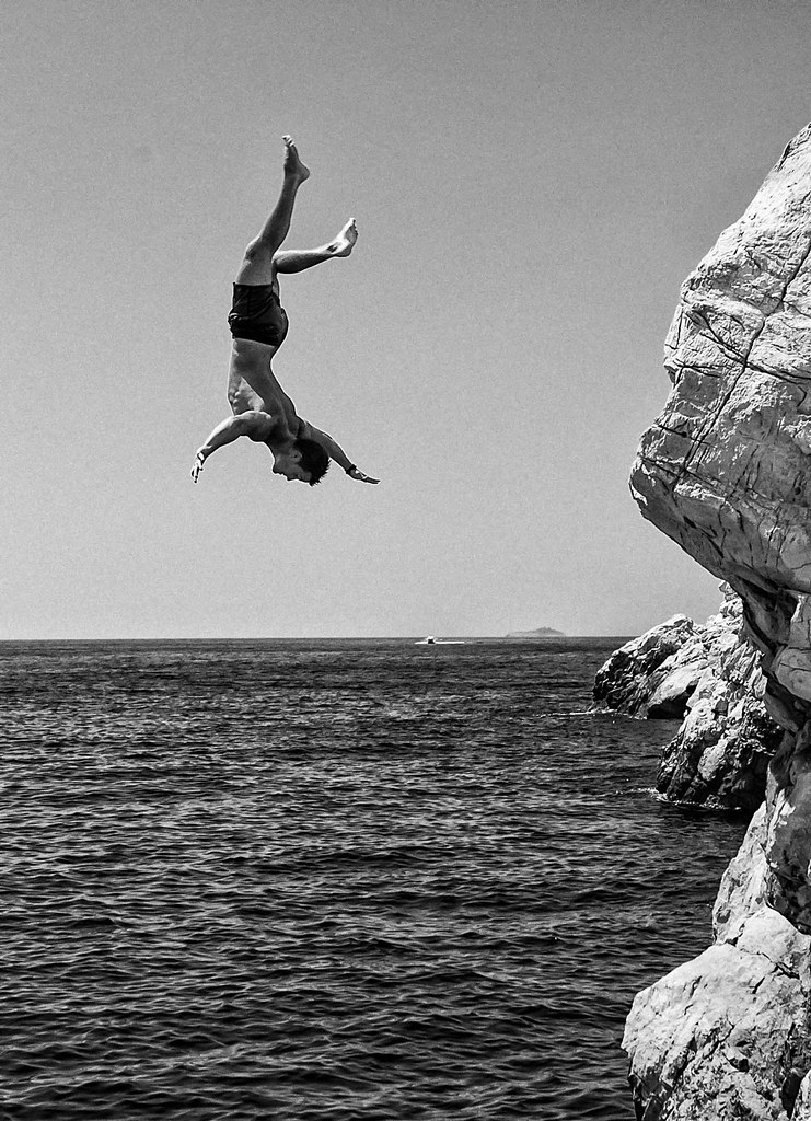
The third is a well-executed "levitation" shot, but this is something I've just seen too many times - my fault for getting jaded - probably others with more open minds will enjoy it.




![[No title]](/data/xfmg/thumbnail/34/34054-75057fa828bda4184ea808ff8bd8dfcf.jpg?1734164464)
![[No title]](/data/xfmg/thumbnail/31/31709-79016edd1a9f5ea41ef60f546bd0236d.jpg?1734160386)
![[No title]](/data/xfmg/thumbnail/34/34053-89f2960a2f30add00b9b4379abd6dd12.jpg?1734164460)
![[No title]](/data/xfmg/thumbnail/34/34055-9c9c587b8094b98e1010fe73cead6994.jpg?1734164467)