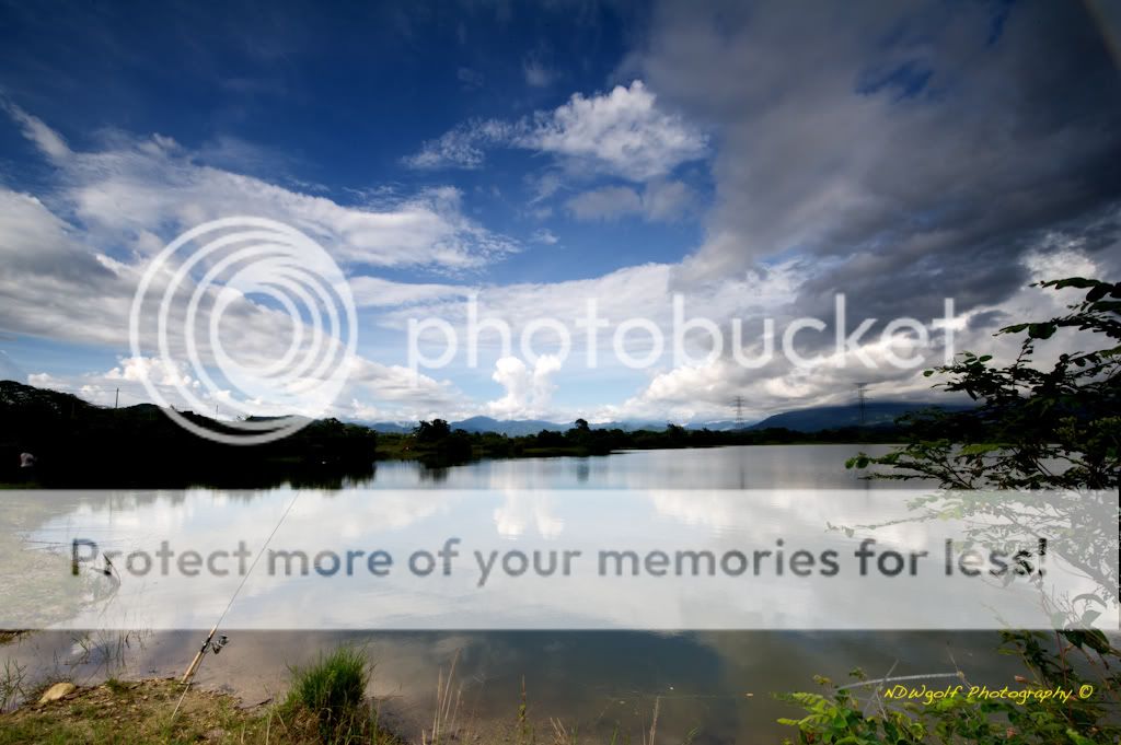
Picture #1 is tilted downwards right to left. An easy fix. Try to lower the horizon as you have it going right through the middle of the photograph. Would make for a much stronger presentation of sky vs reflection in the water. I prefer picture 3 over #2 as that foreground shrub on the right just seems to over power everything else, rather then working with the other elements, while the water runs right through the foreground. Just seems unbalanced to me. Picture 3 has a stronger foreground that the brighter lighting helps. Picture 4 is ok, just doesn't do much for me. And finally Picture 5, the best as most everyone agrees on. Stronger composition with the foreground trees nicely framing the scene. The variation in color intensity from the atmosphere over the valley really helps make this picture a success. Well done.


![[No title]](/data/xfmg/thumbnail/35/35263-86f580cf5d28d23109a45984030a79ad.jpg?1734166920)


