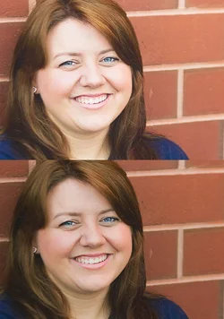
C&C per req: I can't really comment on the colour/WB on this monitor, but it does seem that the red channel might be a wee bit high in 1 & 2, and the DoF a tad shallow. Based on your setitings, your DoF was only around 1 - 1.5" max which, IMO, isn't ideal. I really, really, REALLY dislike the use of the brick wall background. Remember that the eye is attracted to bright and follows linear elements, and what you've done is allowed the grout lines to become a target for the eye and guide the viewer right out of the image. I would have liked to have seen #1 with her chin pushed forward and down a little; see how much younger and slimmer looking her face is in #2? If she were looking toward the camear, that would have been the $ shot!
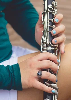
I like the clarinet shot as an image, but since I can't see who's playing it, I don't know it's her. I think some images with her sitting back casually, holding the instrument would have worked well.
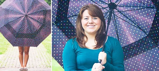
I think the grass and bricks in the brolly shot are a bit too hot; I think you can probably recover that in post, but her legs look over; a big reflector panel would have helped here, and for the other side, I agree, a little too square on, as well as a bit hot on the skin. A big diffusion panel image left and a touch of fill flash camera right would have nailed this.
Just my $00.02 worth - your mileage may vary.
~John









![[No title]](/data/xfmg/thumbnail/35/35968-01893eeb6a205c00827118fe5bb79703.jpg?1734167851)