A few nature Shots

StreetShark

TPF Noob!
Joined
Mar 11, 2007
Messages
219
Reaction score
0
Please rate them and give me tips. These where taken last summer.

100_0280.jpg


Shutter Speed: 1/776 second
F Number: F/3.7
Focal Length: 63 mm
ISO Speed: 80
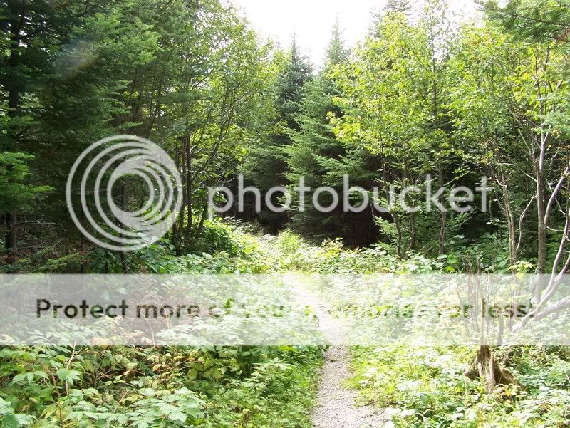
Walking_Trail_by_vicTTim77.jpg


Shutter Speed: 1/79 second
F Number: F/6.3
Focal Length: 6 mm
ISO Speed: 100
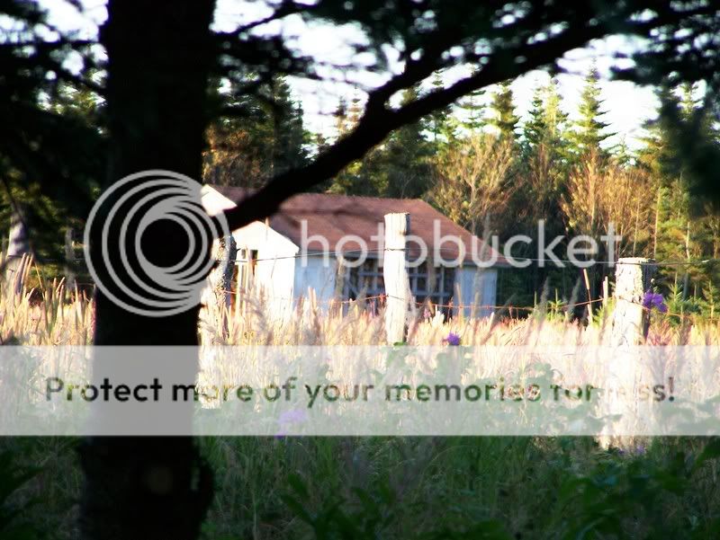
Cabin_by_vicTTim77.jpg


Shutter Speed: 1/194 second
F Number: F/3.7
Focal Length: 63 mm
ISO Speed: 160

Dripping_twig_by_vicTTim77.jpg


Shutter Speed: 1/64 second
F Number: F/3.2
Focal Length: 21 mm
ISO Speed: 100
 
Hiya StreetShark and welcome to ThePhotoForum.

I have moved your post to the General Gallery/Landscape and Nature Gallery/People and Pets Gallery. The Photo Critique section is reserved for more serious critique and therefore we like to keep it to one image at a time...(see FAQS), otherwise it just gets too confusing.

Feel free to post multiple images in other parts of the forum...or to re-post your images individually into the Photo Critique section, with more of an explanation of the shot, equipment used, settings, and some remarks on what you were trying to capture and to show.

Thank you.

Now to your photos:

# 1 has a nice DOF and lovely subject. The flower and the bee. Always good, quite the classic. I love the green! (I love that ALWAYS). Compositionally it is very centred. That is a bit of a minus here. Exposurewise and with regards to focus, though, this is spot on. I'd crop it so the flower and the bee show off center and come closer to us.

# 2 looks overexposed. I guess the camera measured for the dark parts beneath the trees ... nice path, though. I might have felt inclined to leave the sky out of the frame all together, if I had been there. And I find it is easier to brighten a slightly underexposed photo than to rescue an overexposed one. (Often the latter is downright impossible). The colours show nicer on a slightly underexposed photo, too.

# 3 looks like it was meant to be a cool framing-within-the-frame idea by including the tree, but in the end it all went wrong. There is no clear focus, the major part is overexposed, large parts are dominated by that tree in the foreground ... sorry. This one didn't work out.

#4 is a lovely motif and much reminds me of my current wallpaper on my computer ;) ... again DOF is great and focus is perfect, exposure is right, too, but I find it lacks in the composition department. But there is room enough for some cropping and you should try that to find out what feels more "compelling" than a centred motif. Test it out for yourself. See what you can do with your photos.
 
Ok sorry for posting in the wrong spot and thanks for the critique.
 
I like the 1st shot the most.
 
like the 1st shot and the 4th shot the best, the 3rd has a sinister feel to it which I like but as LaFoto has said the focus is a bit off, would look a lot better if the house or shed or whatever it is was in focus
 
I like em all, except #2 (too overexposed in areas). Nice shots!
 

Most reactions

Back
Top