Oh, you two are so right ... I had been into this thread via the "New Posts" and never quite got where I was and where it was placed ... now I moved it to the General Gallery since it does not quite follow the guidelines for the Photo Critique.
As to the photos shown here ... the second is definitely showing signs of camera shake and I simply do not understand the last but one here.
I quite like the one of the two children, though they slipped out of focus by their movement, I'm afraid, and the background feels a tad cluttered. But the use of window light (?) is definitely appealing!
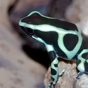
And the first is green.
And in focus.
And not showing camera shake.
All three good elements (!) (Yes. Green is a good one, too, in my mind. )
I did the same thing as far as posting things in the completely wrong place and putting too many - oops! I wasn't used to a message board with so many different categories! I'm getting the hang of it now though/. I like the one with the little kids.
I'm no one to critique though, I dont know much but I know i like what i see!



 (Yes. Green is a good one, too, in my mind.
  )
)








![[No title]](/data/xfmg/thumbnail/37/37602-1ef8dbb1c2d0e4ff347ee65d328c3603.jpg?1734170730)