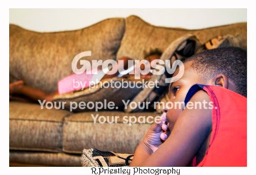
The first one seems too busy. Maybe getting an angle from the other side so you can get more of the boy's face so the attention is drawn more to him. That or a shallower DOF to isolate the subject better. Not sure but it is missing something, leaves me searching for a focus point. As for colors, they seem a little washed out and the background colors seem to blend with the foreground colors therefore not having much of a subject/background seperation. The black and white version of the first picture does add more presence to your nephew but leaves me wanting to see more of his face. These are just my opinions so take them with a grain of salt as I am no expert, just relaying the feelings I get from them. Great looking kids,
Nick





![[No title]](/data/xfmg/thumbnail/37/37602-1ef8dbb1c2d0e4ff347ee65d328c3603.jpg?1734170730)
![[No title]](/data/xfmg/thumbnail/36/36400-97a007ae878e1032155c7a7d47eeba73.jpg?1734168786)

![[No title]](/data/xfmg/thumbnail/37/37605-90c8efaef5b7d1f52d4bf8e7dfd33673.jpg?1734170732)
![[No title]](/data/xfmg/thumbnail/35/35952-55c8d42ec1c6ff0e13b45356cbf9c068.jpg?1734167758)