A few portraits for critique, how am I doing?

mc1979

No longer a newbie, moving up!
Joined
Mar 30, 2011
Messages
270
Reaction score
52
Location
Al
Can others edit my Photos
Photos OK to edit
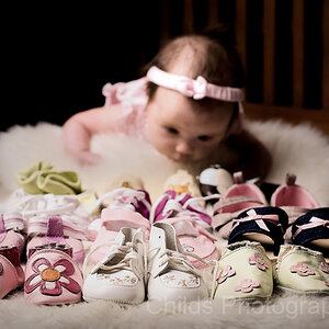
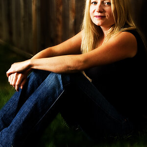
I practiced on my friend's little girl the other day. These are some I have edited, and so far my favorites. Let me know how&nbsp;I did. Upon uploading to flicker the look like they have lost some sharpness. <BR>I took these with Nikkor 50mm f/1.8 G.<BR><BR><BR>1.<BR>Karli-1 by mchatham79, on Flickr<BR><BR><BR>2. <BR>Karli-2-1 by mchatham79, on Flickr<BR><BR><BR><BR>3.<BR>Karli-4-1 by mchatham79, on Flickr<BR><BR><BR><BR><BR>4.<BR>Karli-3-1 by mchatham79, on Flickr<BR><BR><BR><BR><BR>4.<BR>&nbsp;&nbsp;&nbsp;


I don't know what is going on with this post. I numbered the images, and not sure why this is all showing up.

Anyways, rip them up for me. Oh, and in #3..my bright orange shirt is reflected in her eye!!! Lesson learned not to wear that any more! LOL.
 
Not sure about the composition of #1 kind looks like the she might be squished at any moment. LOL The lighting is great on all of them (I am so struggling in that area). LOVE her eyes in #3. Great job!
 
The first is actually my favorite, but I can see what you are saying! LOL. Actually, in it was a complete rectangle in that wall. I had backed up and it was framing her on all 4 sides, which looked alot better. But when I got them home, pictures were too blurry. It was much cuter though, but a complete fail
 
#1 is awesome! I wouldn't change a thing. The others have cropping issues; in #2 it's just a bit too tight, in #3 it's a lot too tight, and #4 is actually not tight enough, with so much space above and to the right, but even with a tighter crop I think the fence in this one (and more specifically, its lines) are more of a distraction than an aide.

Great job otherwise though! :thumbup:
 
Thanks Brian! The cropping is something I'm trying to improve on, but I think it was Bitter Jeweler who told me there's an art to it, and I'm finding that true! LOL. I see what you are saying about #4 and wondered the same if I had left too much. With the fence, I was just trying to be creative. We were in a park and not too much around it! With #3 what how would you have cropped differently? I didn't crop much, I was actually close to her. Most of the pics I had taken were from a goodways back and I wanted some close ups.
 
mc1979 said:
With #3 what how would you have cropped differently? I didn't crop much, I was actually close to her. Most of the pics I had taken were from a goodways back and I wanted some close ups.

Well the reason I felt it was too tight was because she's crammed up against the left side of the frame, but on the other side there's space, which makes it feel imbalanced. If you'd had the camera aimed just a bit more left it would have been fine, probably.
 
Thanks I see what you are saying! Thanks for the feedback!
 
The 1st is the best for me,really nice picture,good colors,lightning is perfect,and the frame is very interesting,though. :)
 
50mm gets good light! great job:thumbup:.. my only advice is that it is better to post a few photos at a time so that you'll get better C&C.. :sexywink:
great job though! :thumbup:
 
I love #1 too! I think its a very unique composition!
 
The first is actually my favorite, but I can see what you are saying! LOL. Actually, in it was a complete rectangle in that wall. I had backed up and it was framing her on all 4 sides, which looked alot better. But when I got them home, pictures were too blurry. It was much cuter though, but a complete fail
-
I don't think it is a complete fail, you can always do a 4x10 panoramic and see if you like it. I did not like the cinder block wall so did a texture on it, just a thought.
-
606_10x4.jpg

-
Shoot well, Joe
 
Joe I can't see your edit, may be that I'm on my phone. I'll check it out on my computer later. What I meant by a fail was on the first one I had composed the shot where you could see all four sides of the wall, but she was blurry, I guess my focus was off. I really liked that shot.. But couldn't use it. :(
Thanks all for the comments.. I haven't been shooting long, and I'm really trying to nail lighting, work on overall composition and my editing
 
1. Is like the literal embodiment of Rule of Thirds. How could it possibly fail? lol
 
My fav is number 2. It has the best colour and I like the use of progression that goes through the figure. The 3rd and 4th seem to have colour issues.
 

Most reactions

Back
Top